Project Overview
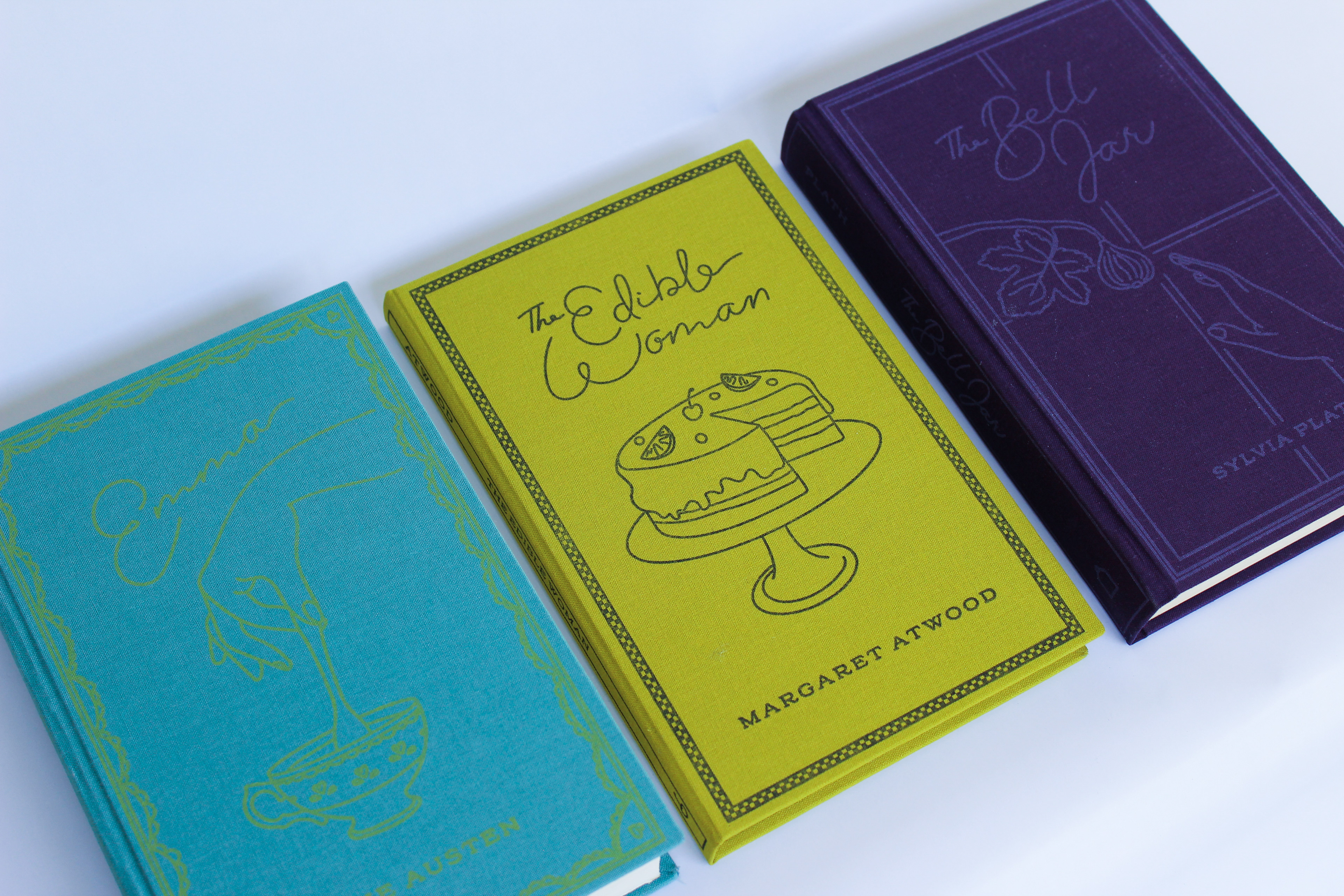
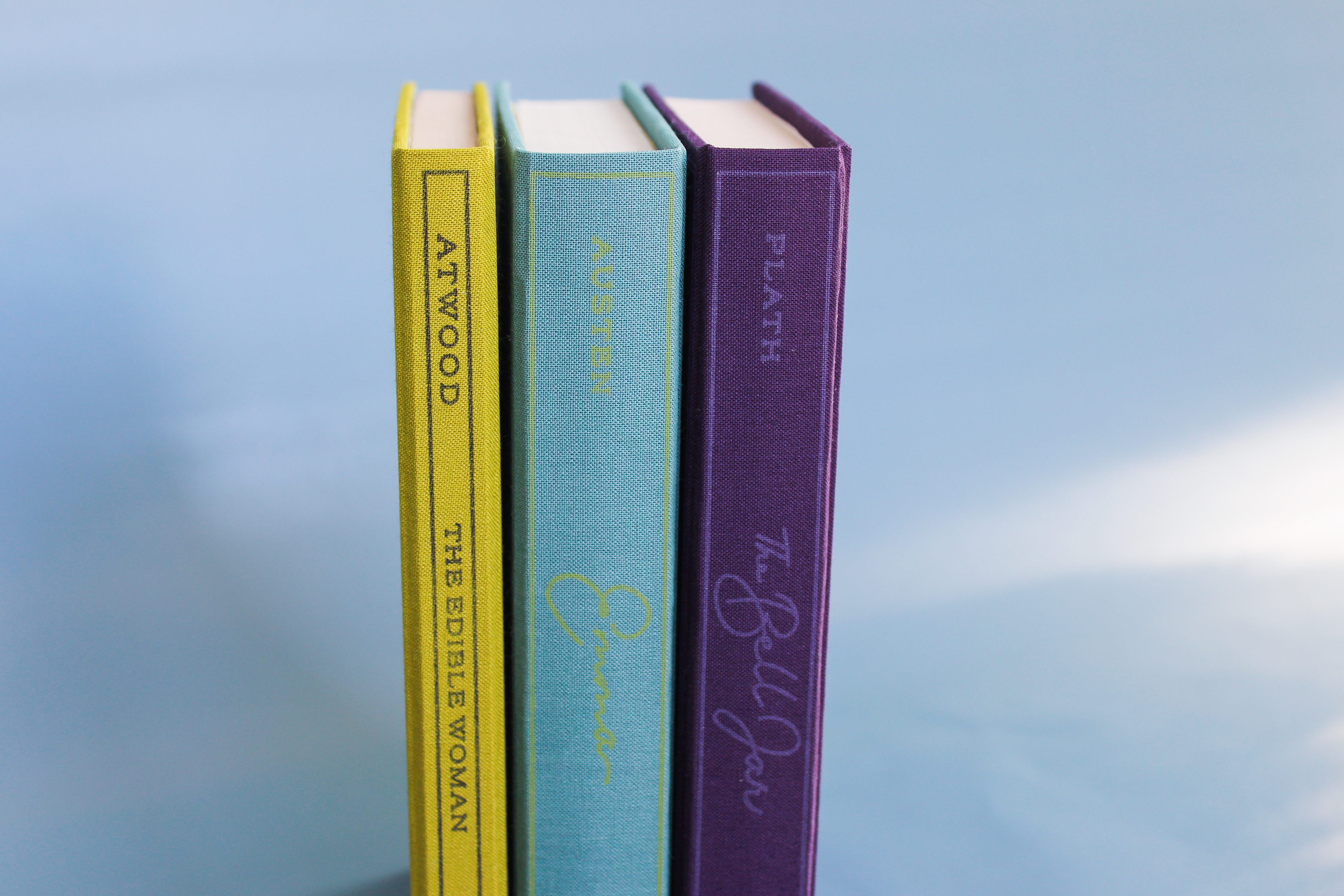
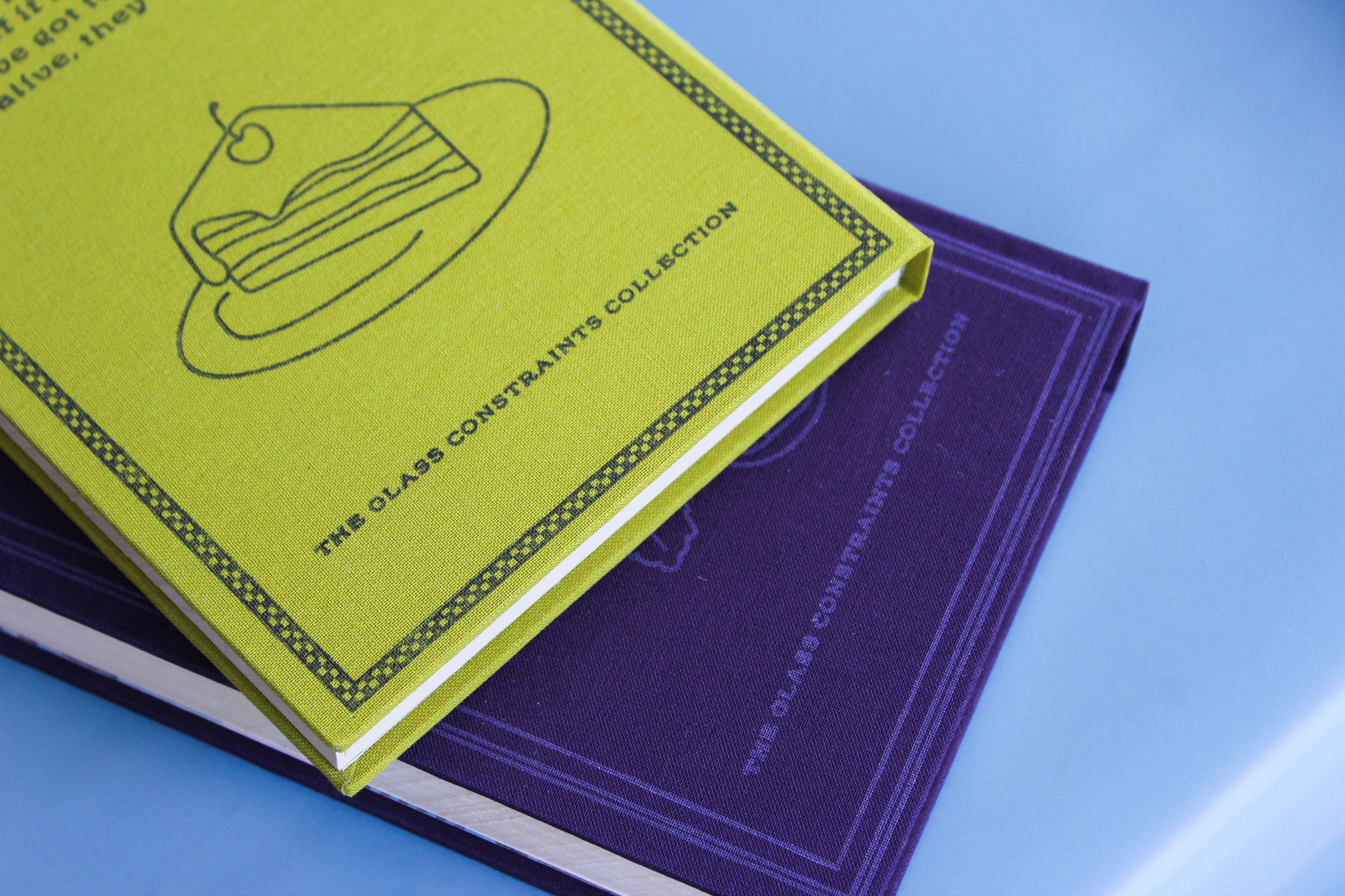
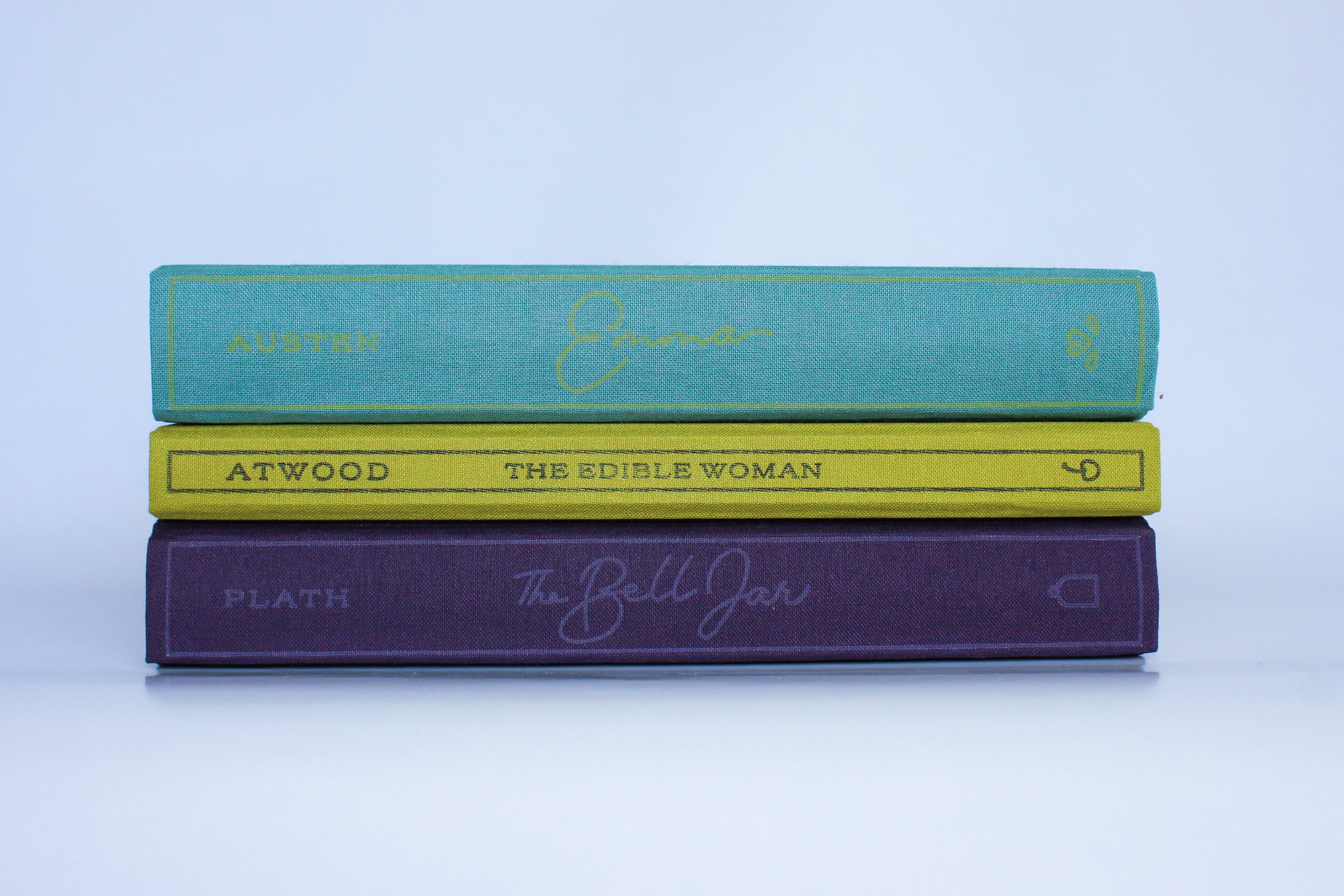
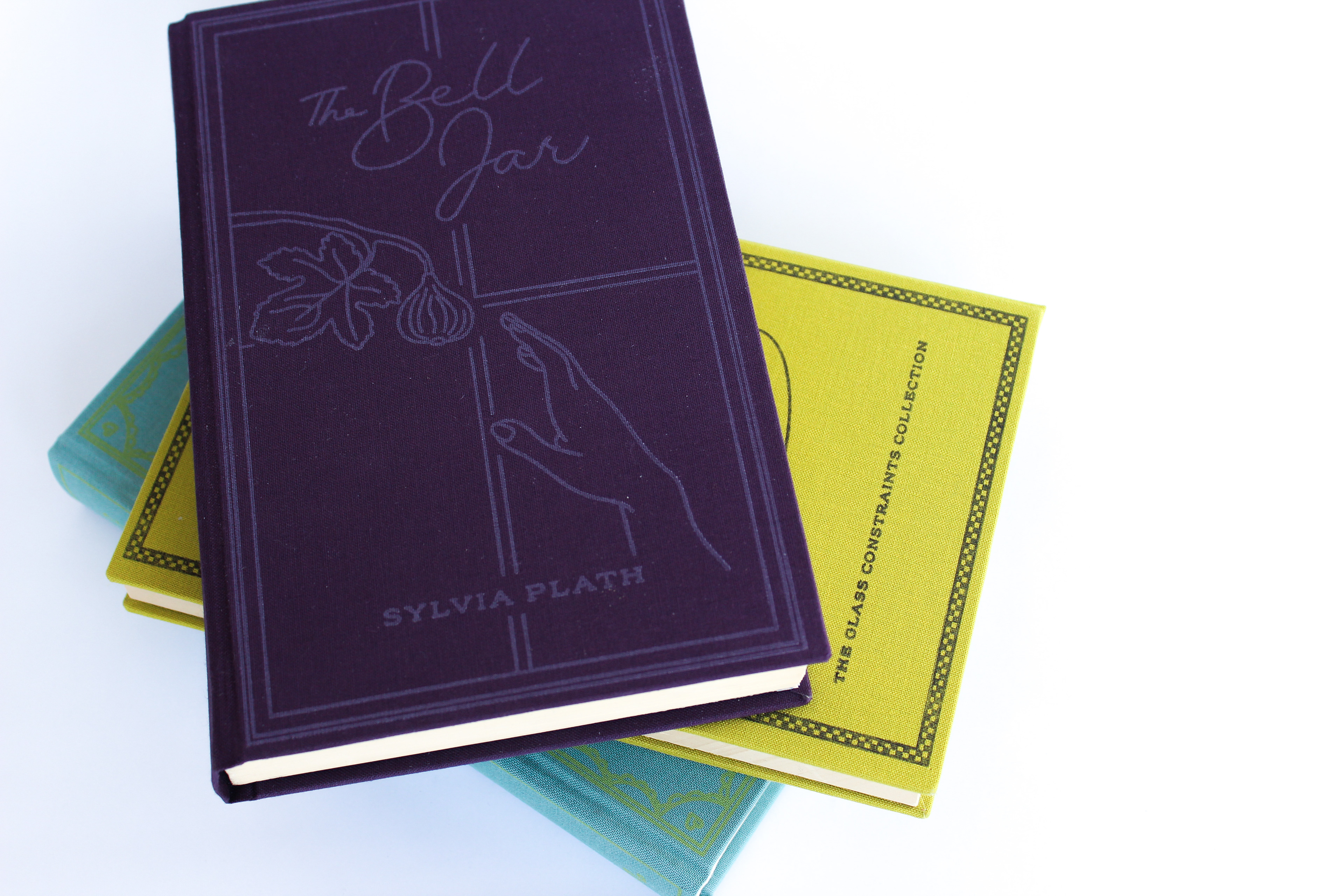
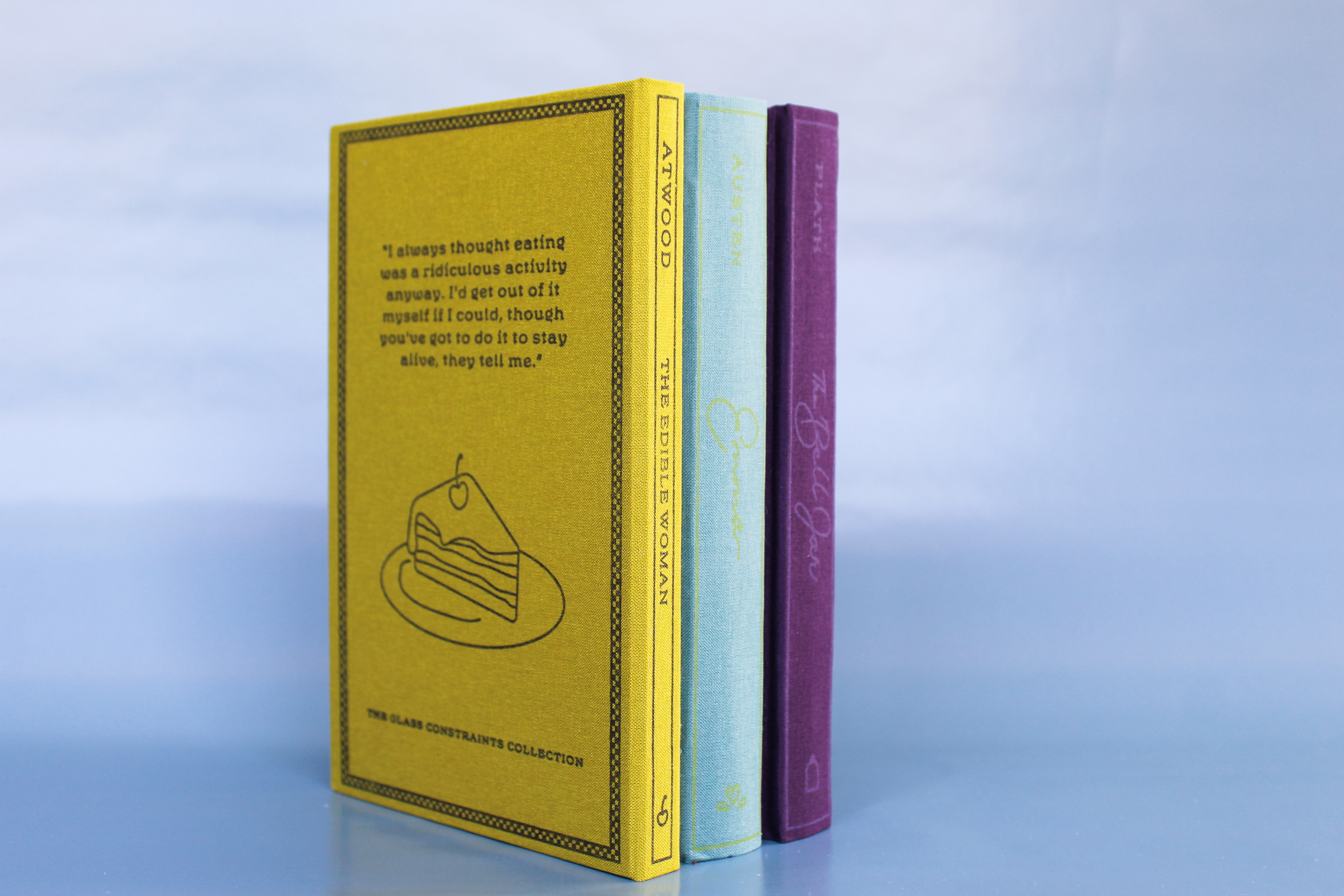
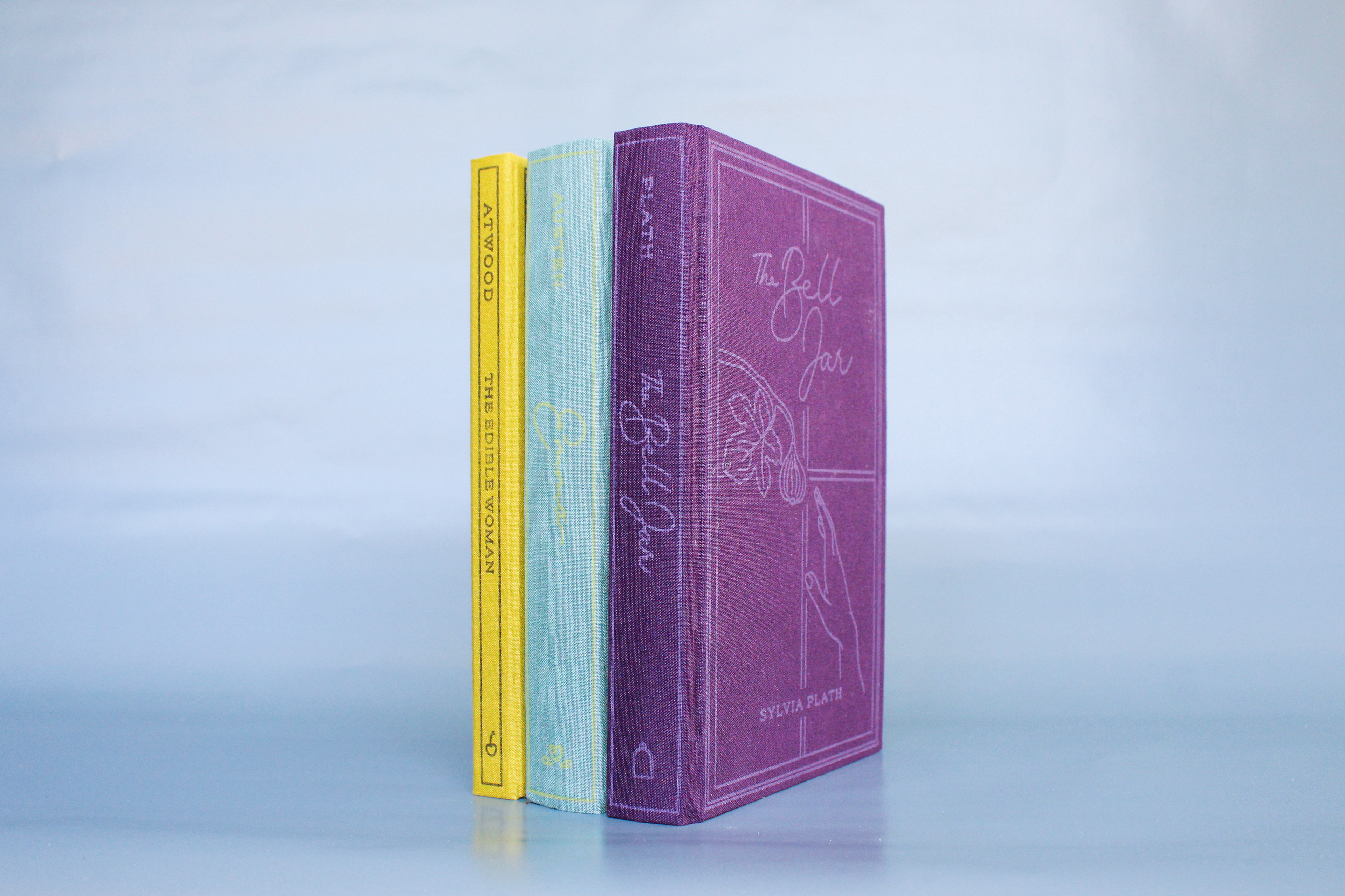
For my senior capstone, I wanted to study the art behind book covers from the psychology behind them to the way they are produced. I redesigned the covers of three classic books by female authors and approached the designs as if they were sold as a boxed set which I named The Glass Constraints Collection. The goal was to create three clothbound covers that represent the individual storylines of each book, but look and feel cohesive using my knowledge of the history and psychology of book covers, and design principles such as layout and color theory.
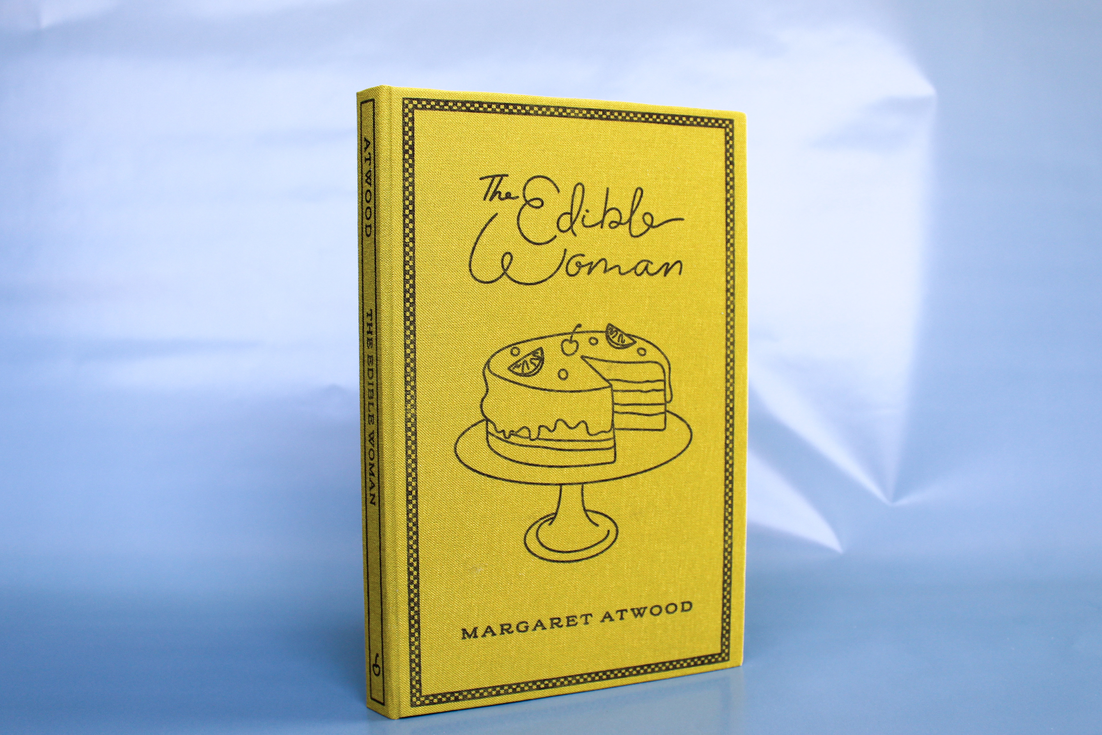
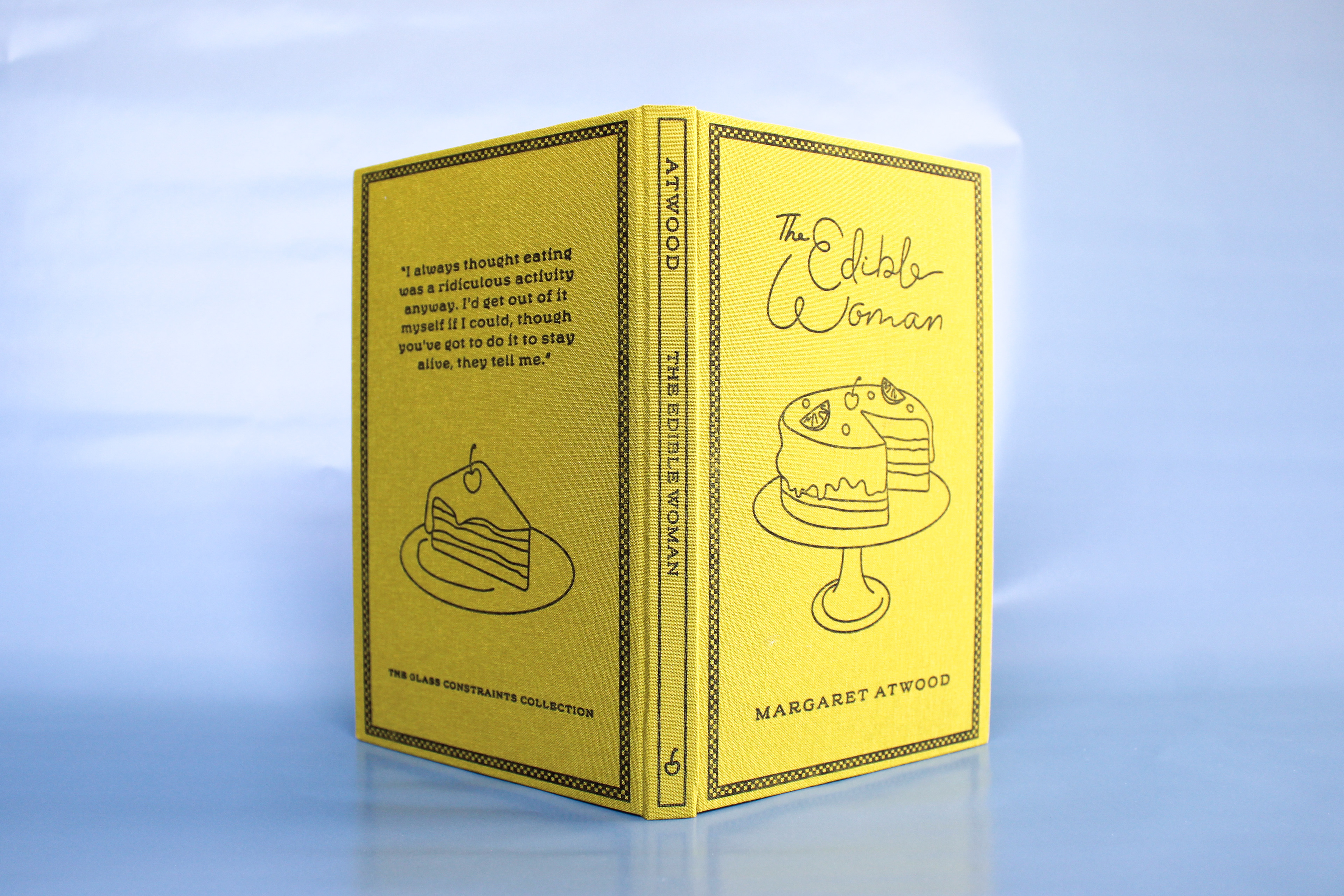
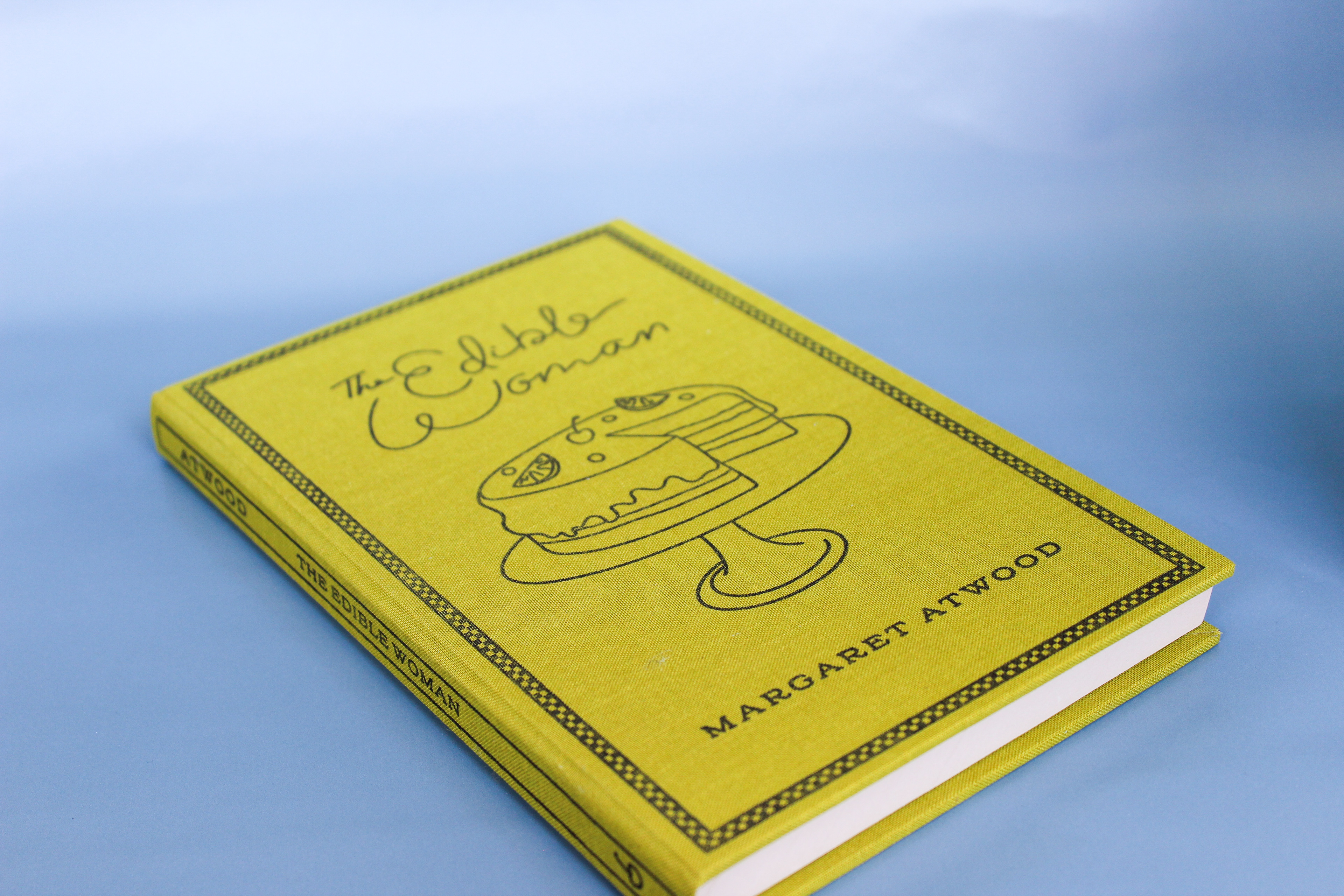
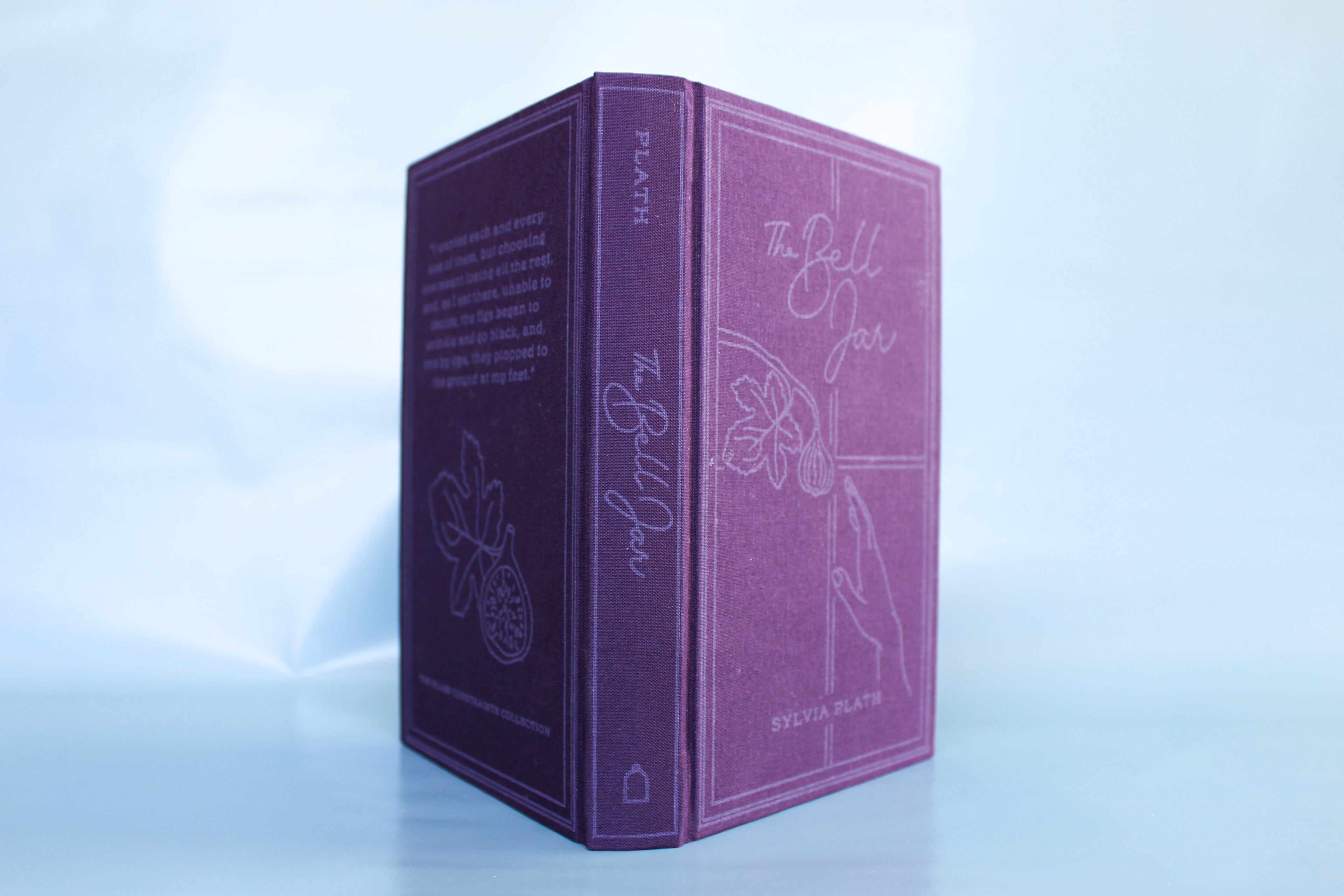
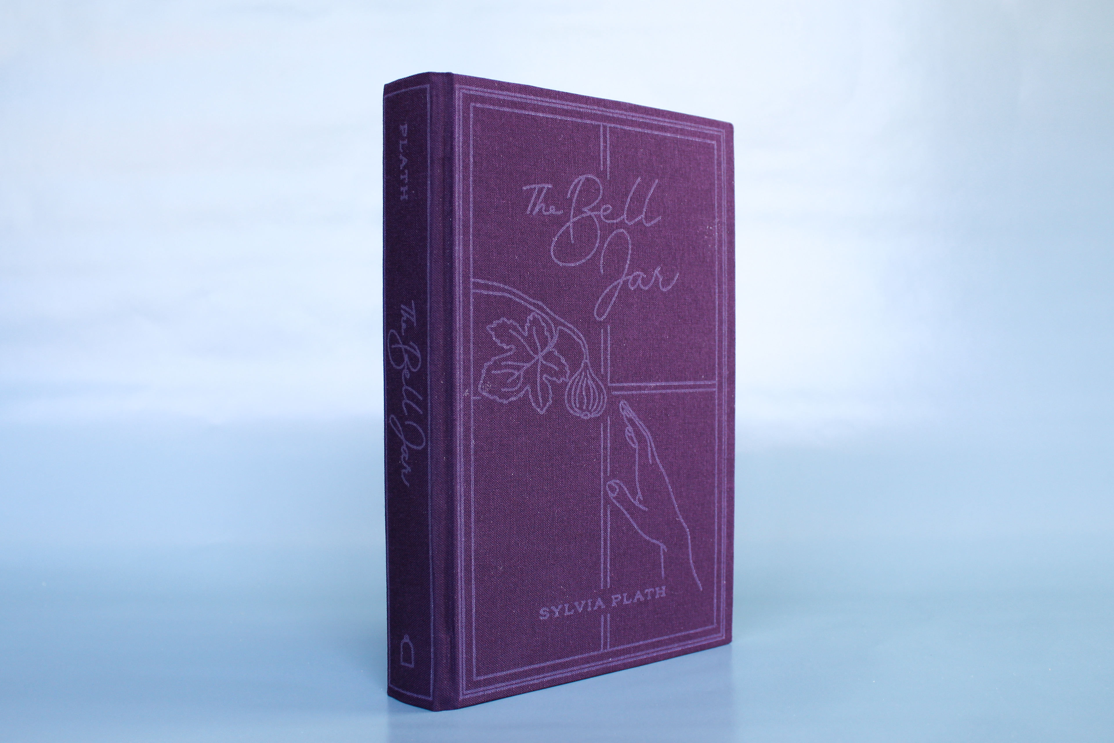
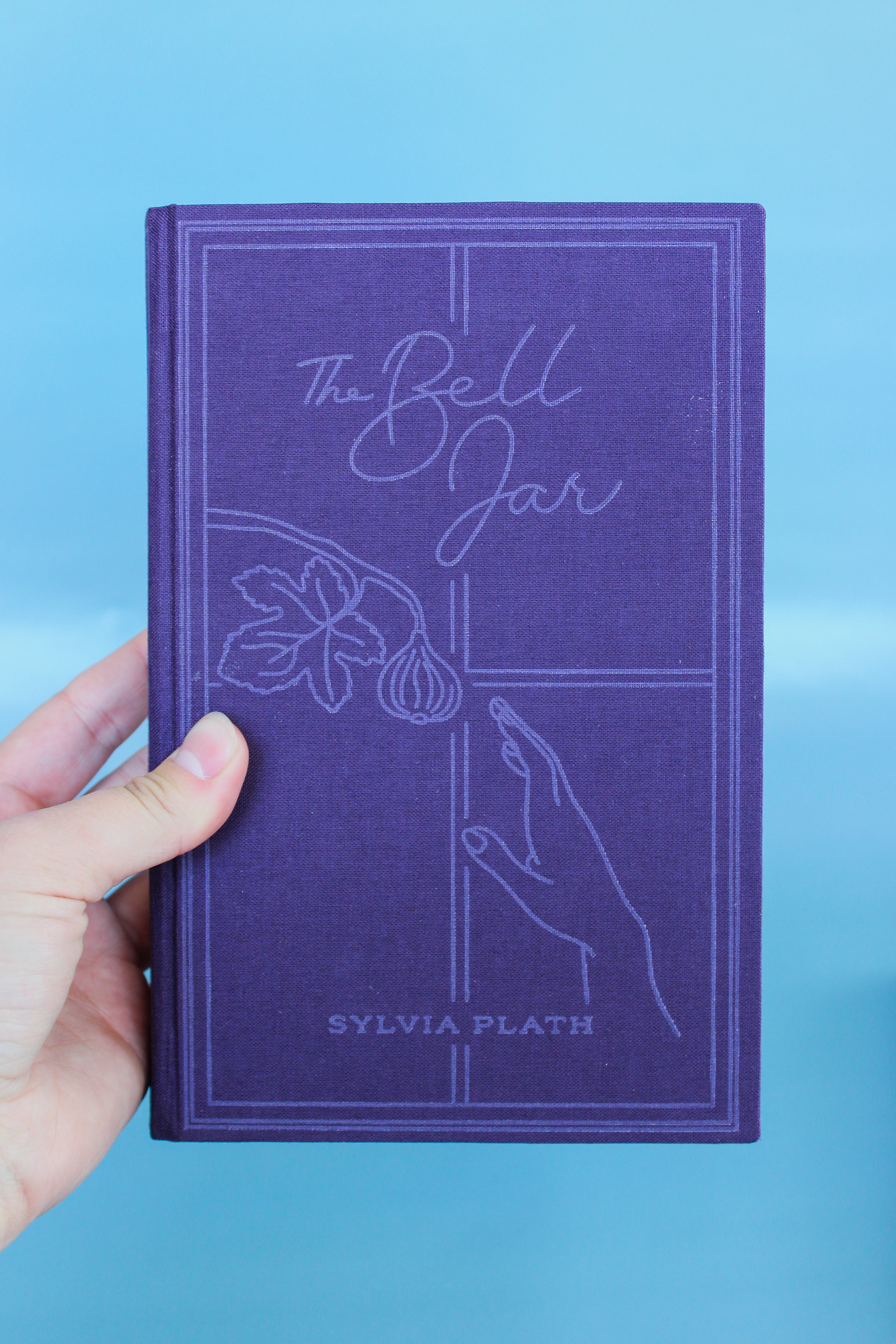
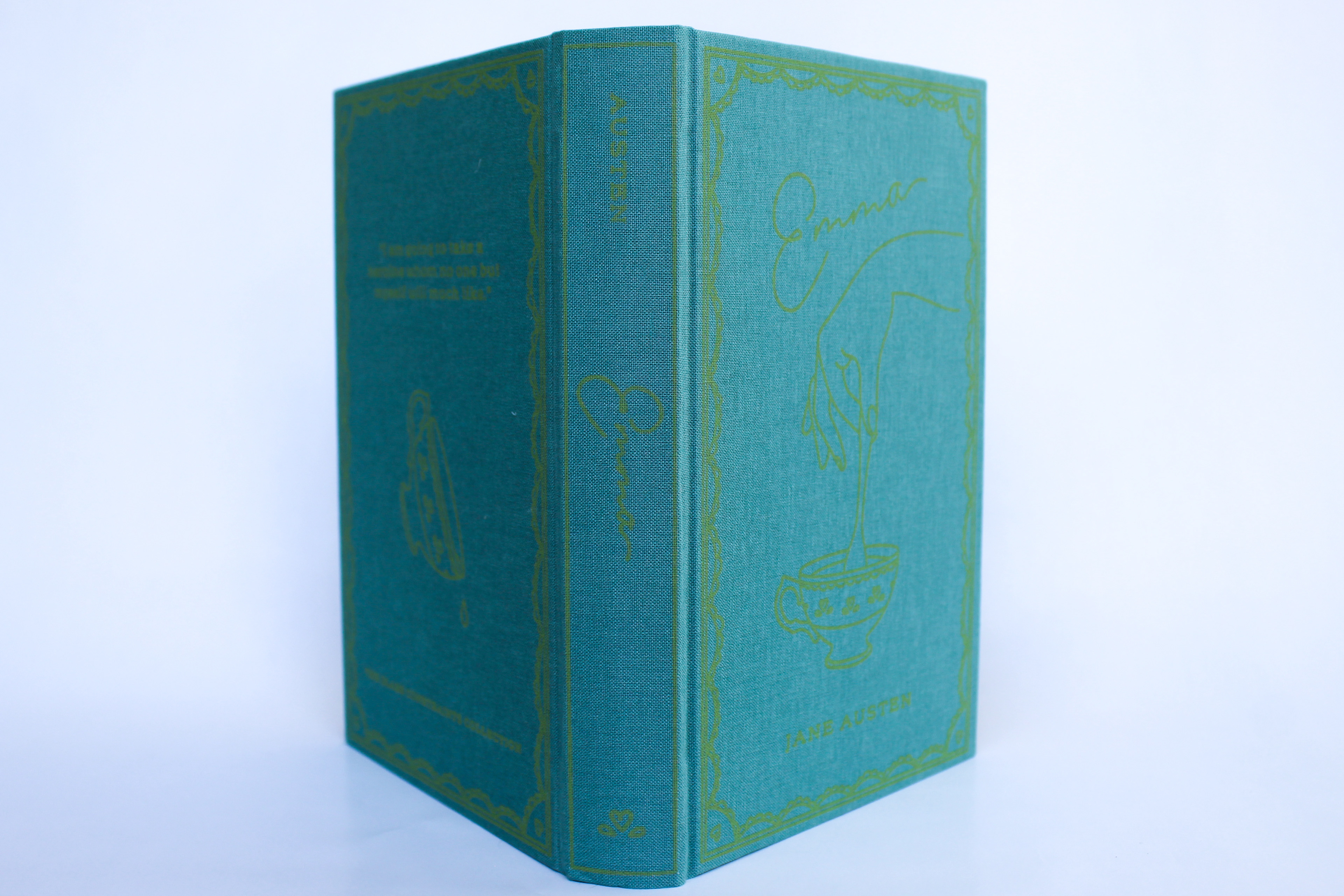
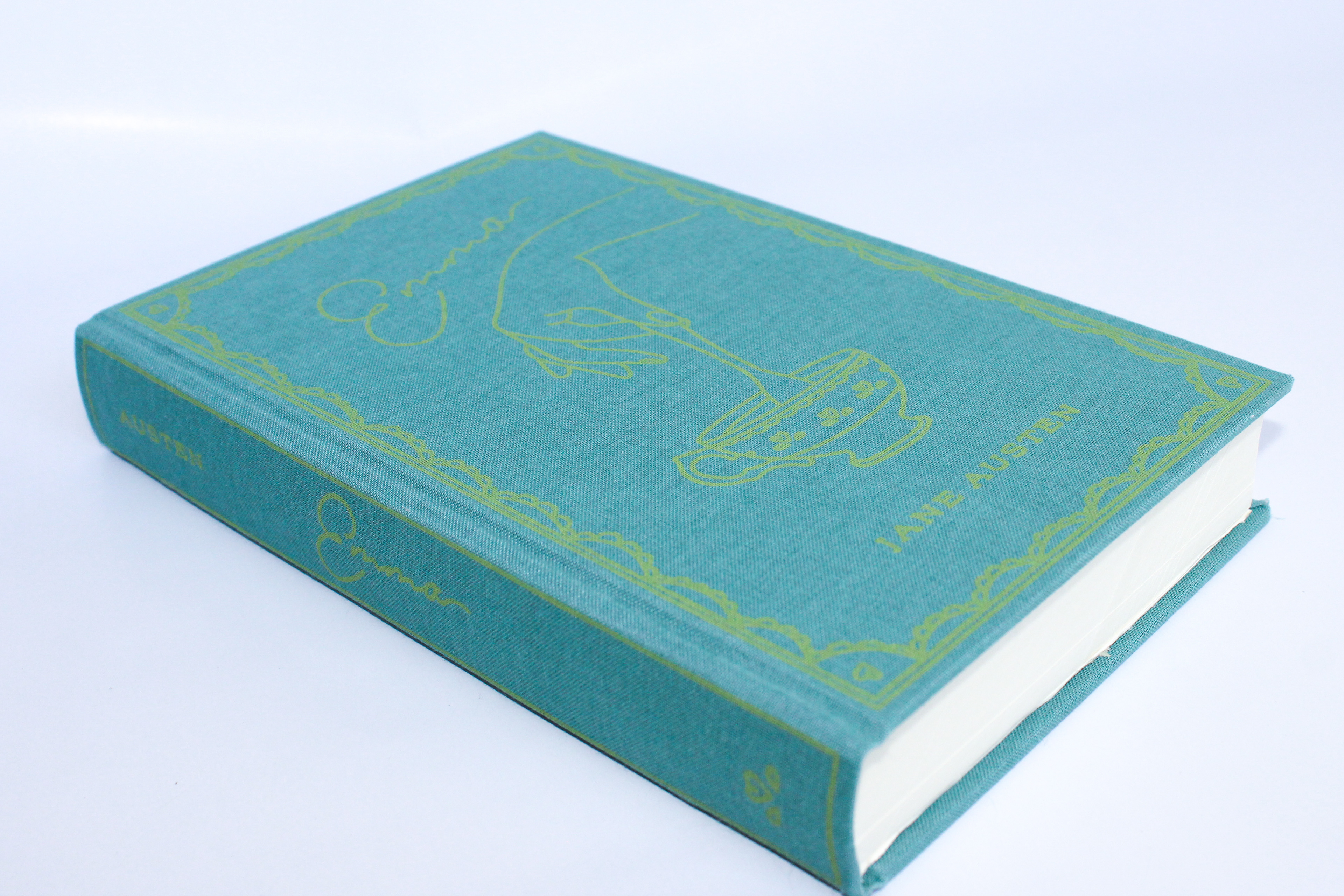
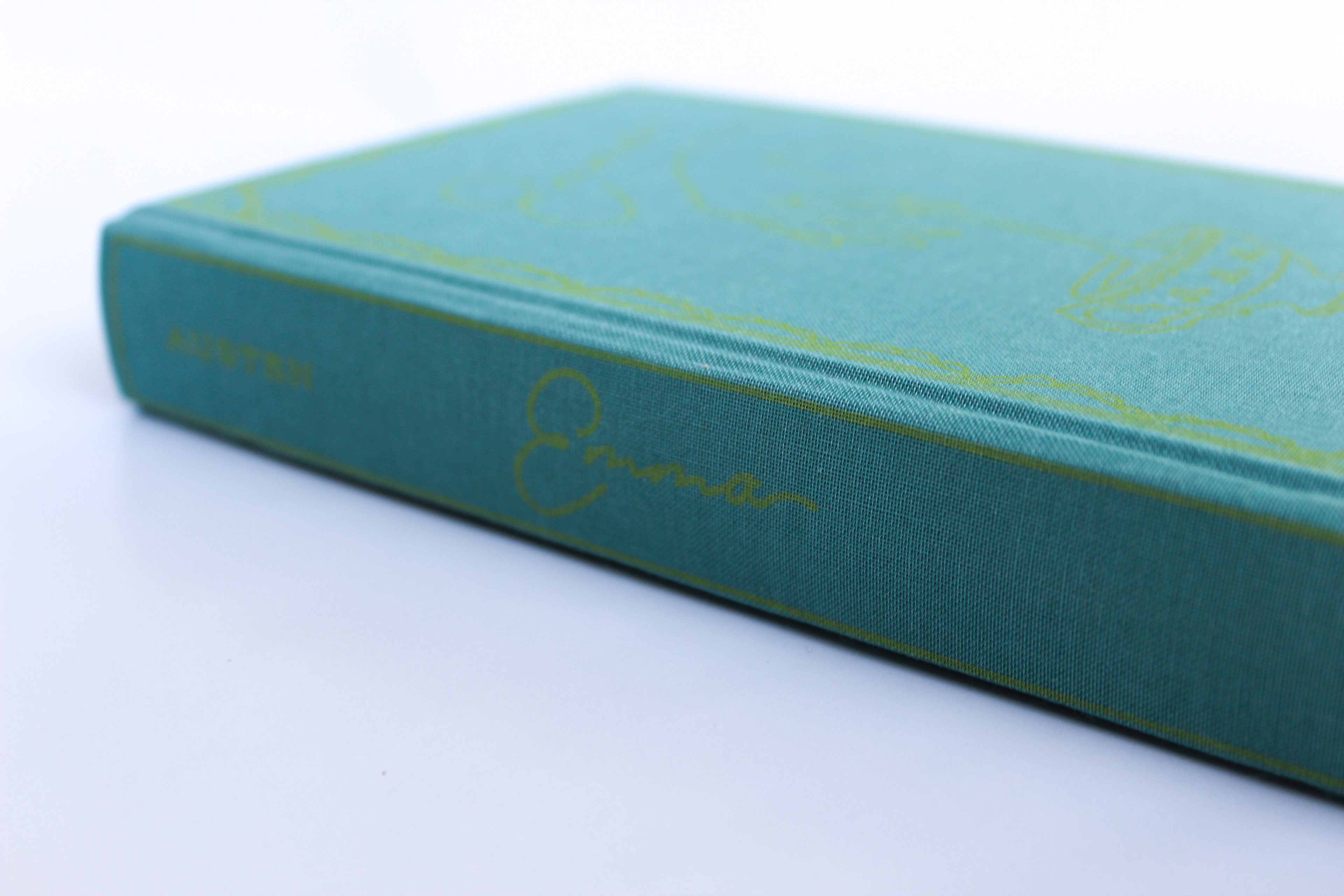
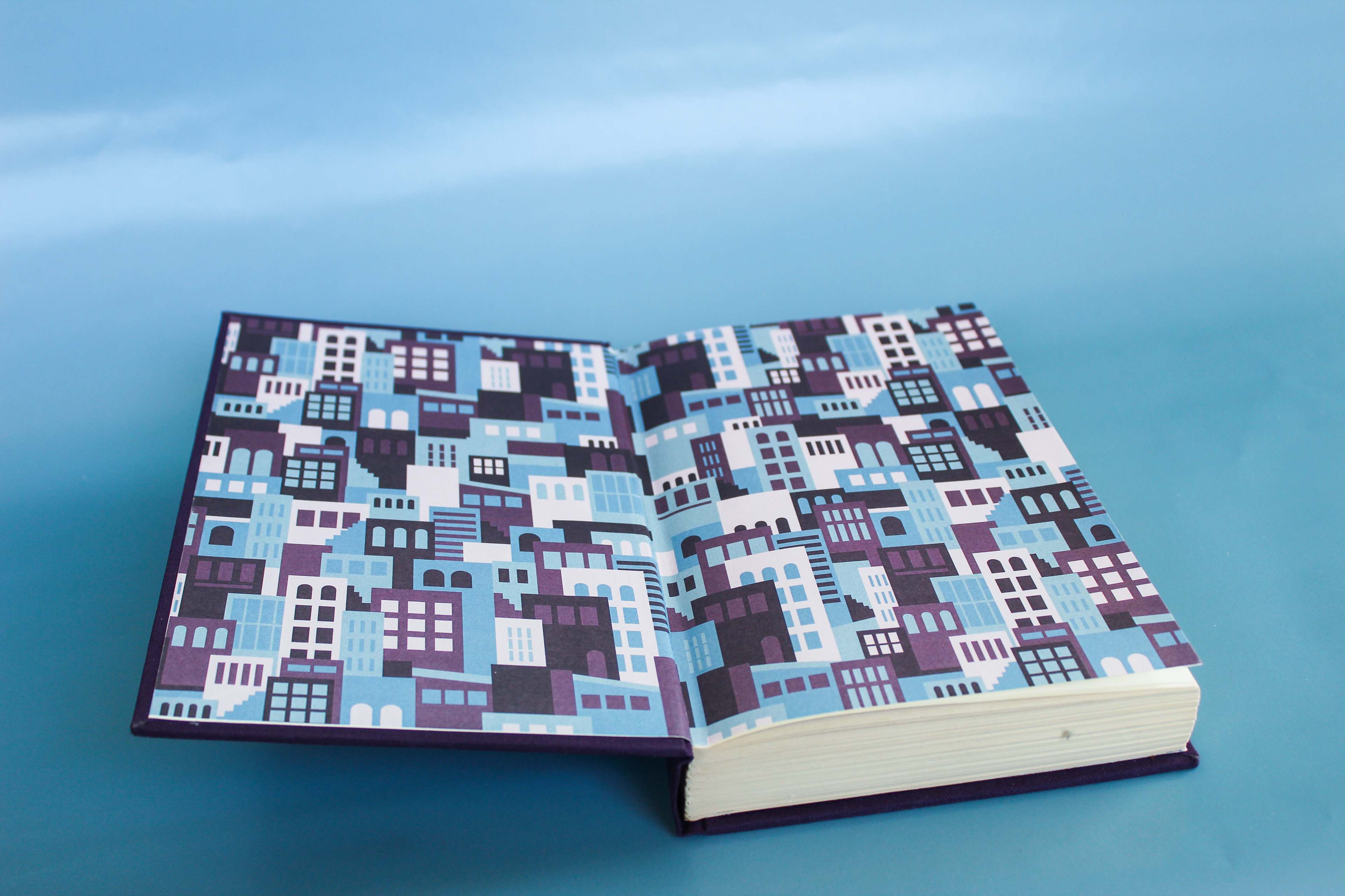
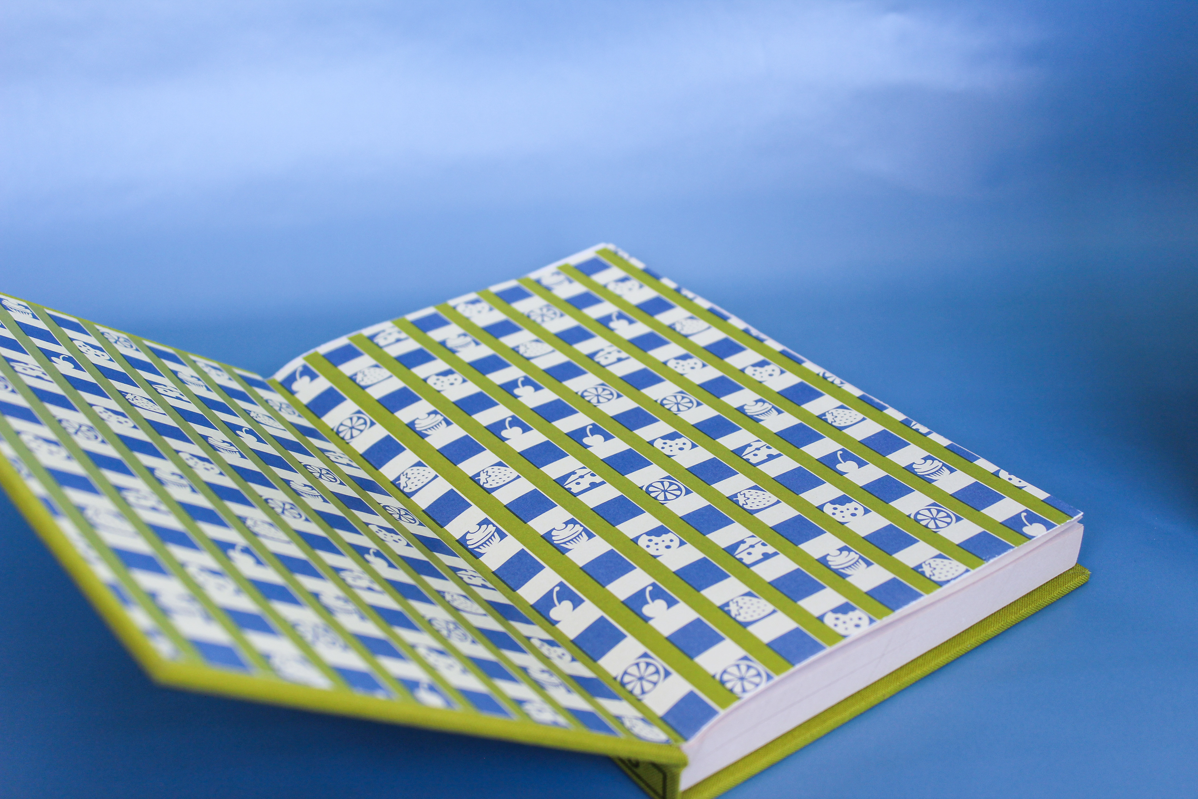
The final books are shown below. To see my full process, see my weekly blog posts below.
Mentors
Coralie Bickford-Smith, Book Cover Designer, Penguin Books UK
Jill Honeycutt, Instructional Associate Professor, Texas A&M University
Jeanne Goodman, Clinical Associate Professor, Texas A&M University
Special thanks to Virginia Green, Associate Professor of Art, Baylor University
Week 14 - Final Week
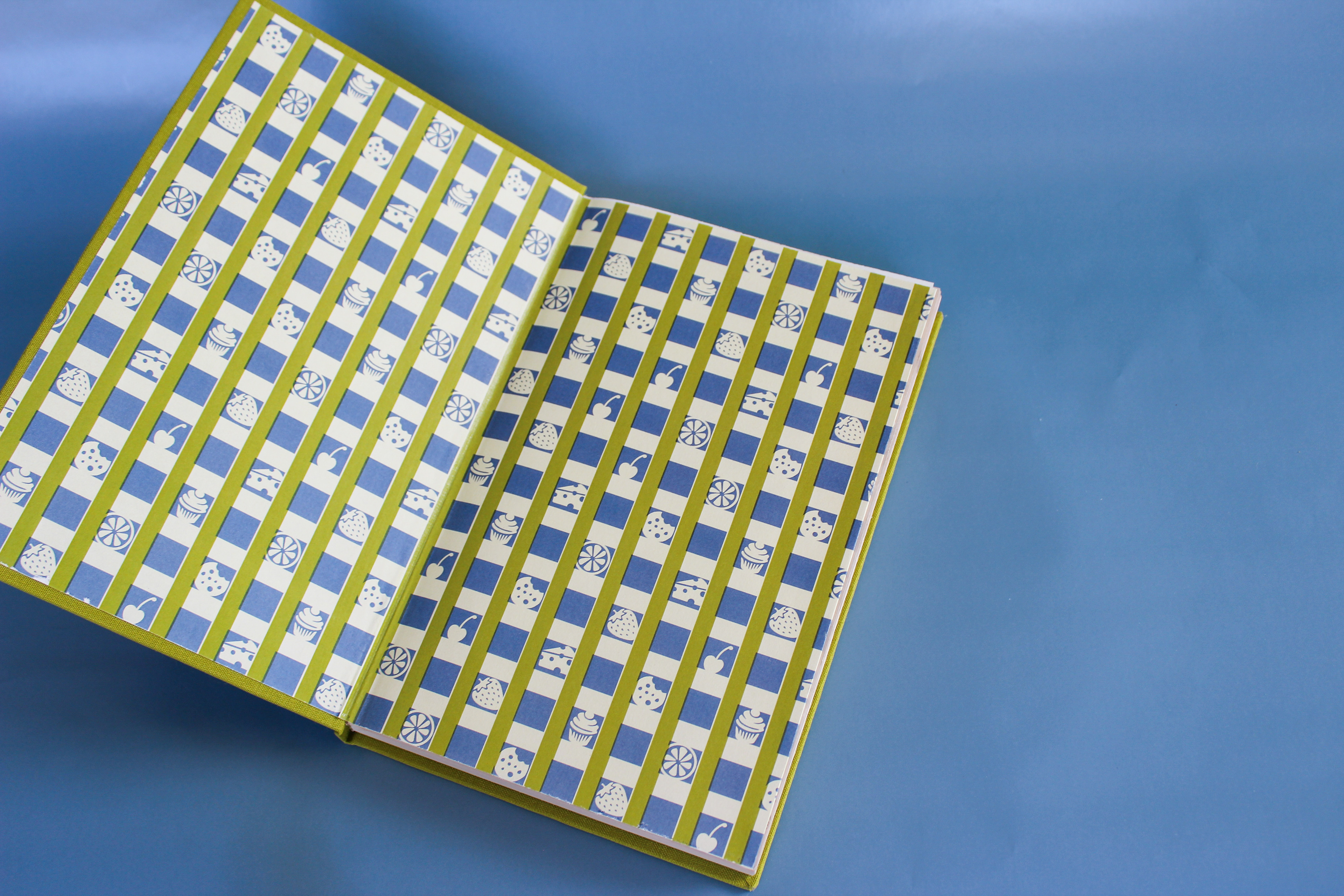
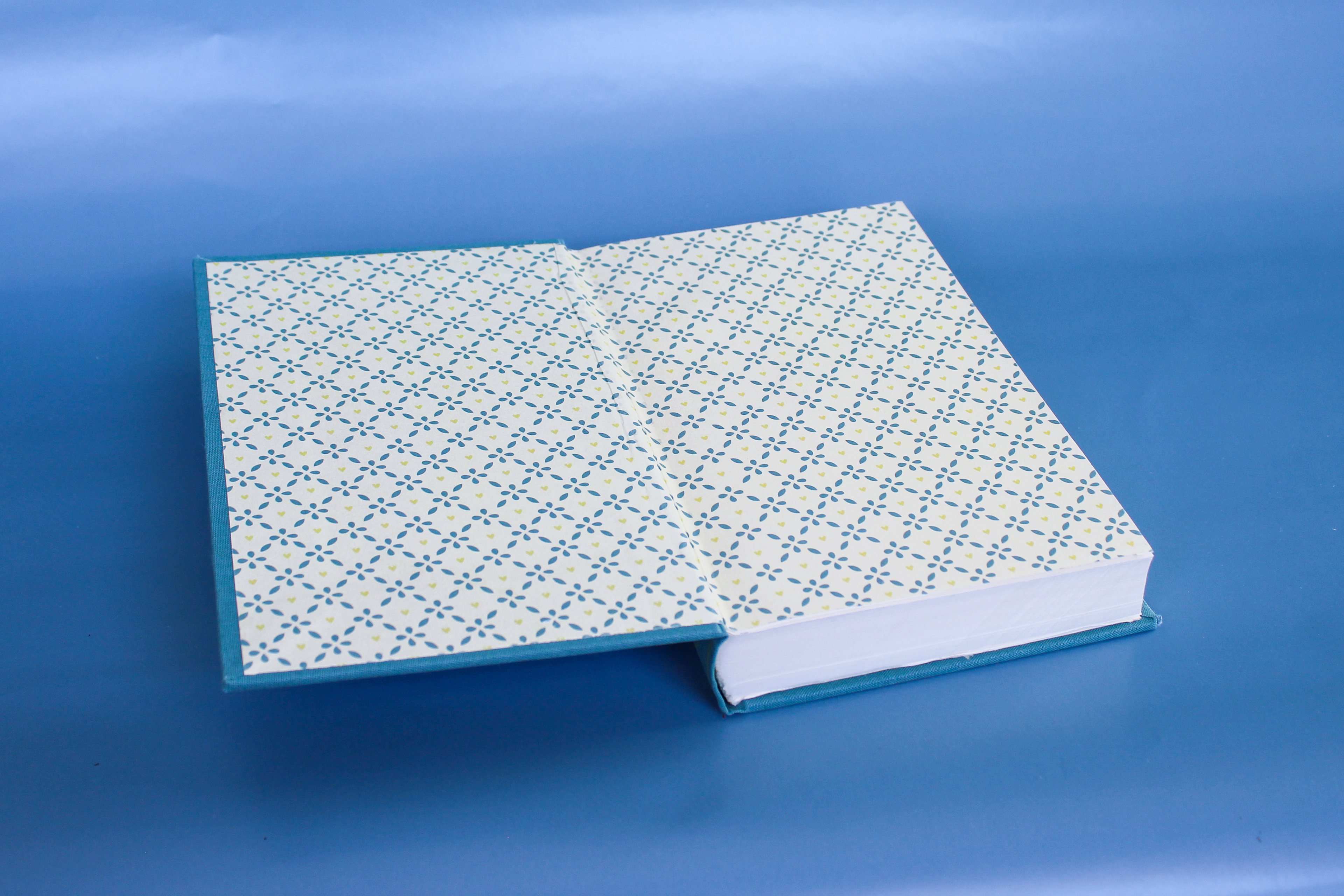
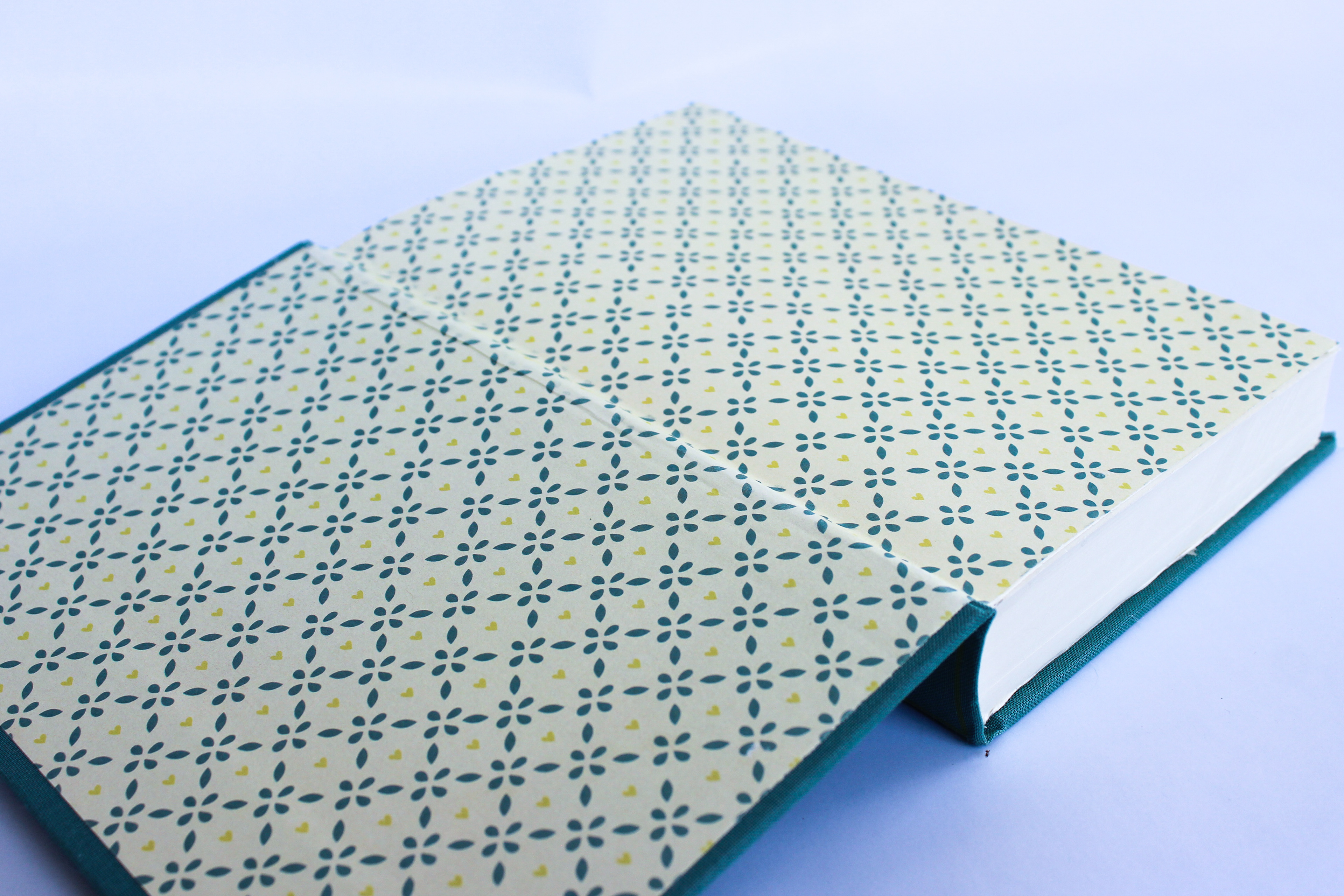
Now that all my books are complete, I was able to take pictures of all of them. I used bulletin board paper as a backdrop and got different angles of the books separately, as a set, and of their end sheets. Once I had all the images, I edited them in Lightroom. All of the final pictures are above. It is so rewarding to see months of work and prep come together to create an end product. I love the way these books turned out.
Through this project, I learned so much about designing book covers, bookbinding, and the book industry in general. My research helped inform my design process and decisions when choosing style and colors. I have more appreciation for book cover designs and the process that goes into printing and assembling books.
Week 13
This week we wrapped up the project with bookbinding! The first step of our bookbinding process was cutting book boards to the correct size. The boards are slightly bigger than the text block to create room between the edge of the pages and the edge of the board. This part is called the square and it helps protect the pages. We also cut pieces of 20 pt cardstock to serve as the spine stiffner. To align the cover designs to the boards, we poked very small holes on the corners so we could see how it was aligning. Once they are aligned, the bookcloth covers are glued to the boards using a glue mixture made for bookbinding. The mixture contains PVA (polyvinyl acetate) and Methyl Cellulose which increases the working time when binding since it dries slower than PVA. There is quite a bit of extra bookcloth compared to the board size so the corners are cut and the cloth is folded and glued to the boards. This is called the turn-in. The assembled boards and bookcloth are called cases.
Next we needed to cut, fold, and assemble the endsheets. We cut them to roughly the size of the text block. The part that gets glued to the board is slightly larger while the flyleaf gets trimmed to the exact size of the textblock. We also pre-folded them and weighted them down to make sure they were flat. We also glued them to extra sheets of Mohawk to give them more stability.
The spines also needed to be reinforced. To do this, each textblock is placed into bookbinding press with the spine facing up. Using the same glue mixture as the case, a piece of mull (a strong cheesecloth-like material) is placed onto the spine and then a thin layer of paper goes over the mull. These materials not only reinforce the spine but provide the material along with the edgesheets to connect the textblock to the case.
To attach the textblock and case, we used lots of glue on the endsheets and aligned the board to adhere them. The endsheets and mull are what hold the book together. Once these pieces are glued for the front and back boards, they are set under weight to dry for 24 hours. It is important to not open the books before then and to use scrap paper in between the endsheets and pages to prevent extra glue from getting on the pages.
Once this entire process was done the books were bound and ready to be used. It was so rewarding to see them done and all together after the entire design and production process.
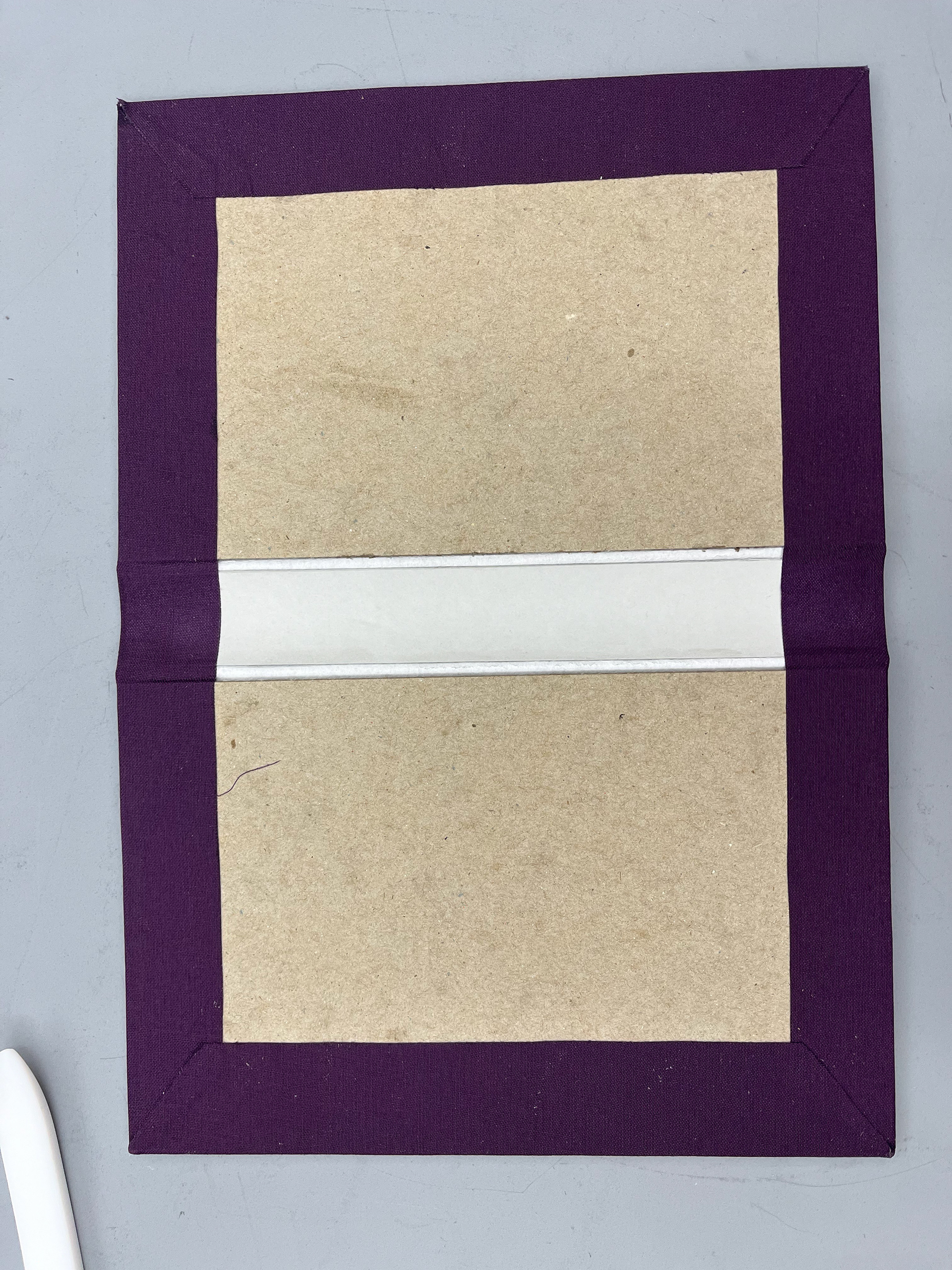
Prototype case
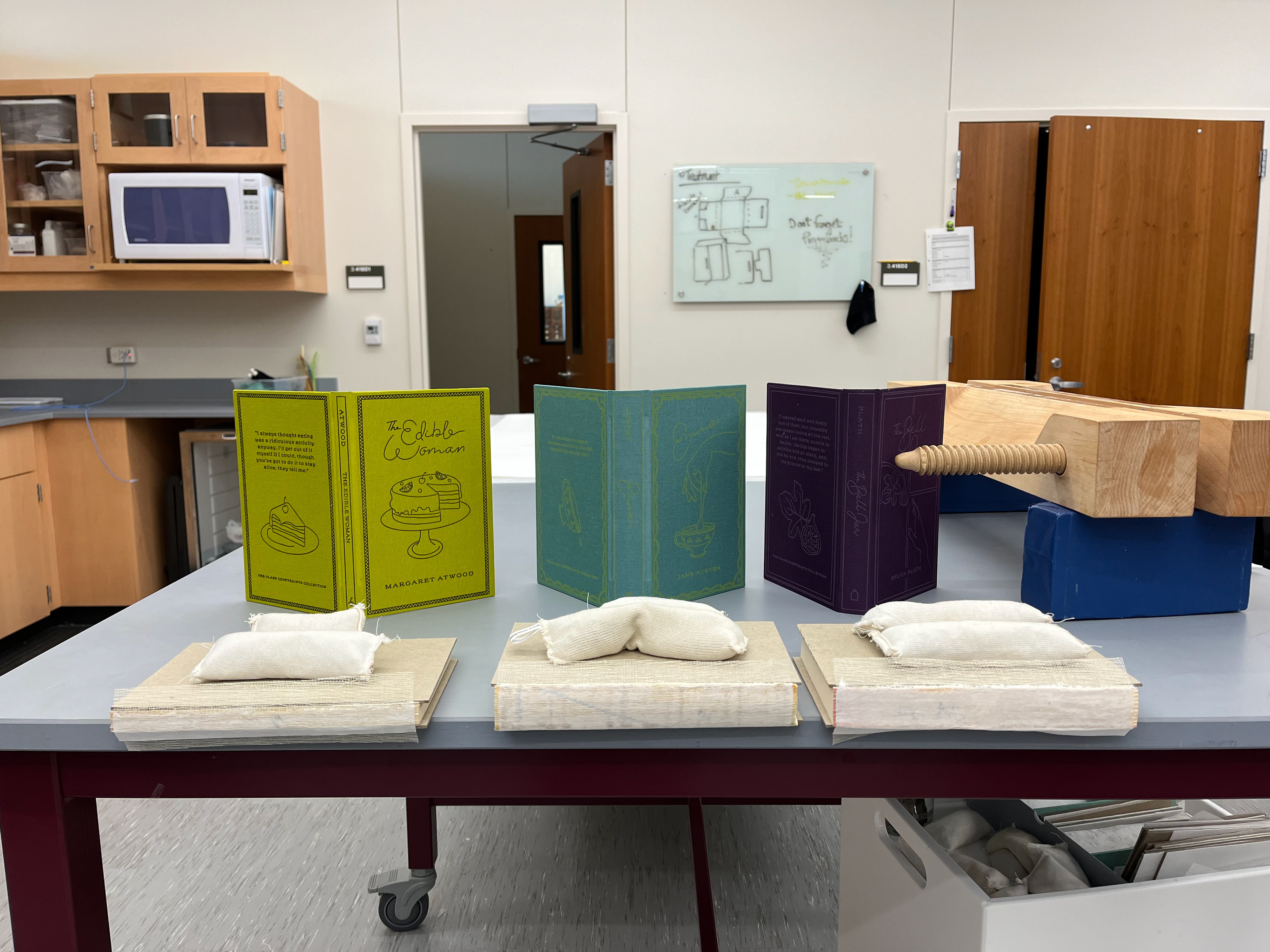
Cases and drying textblocks
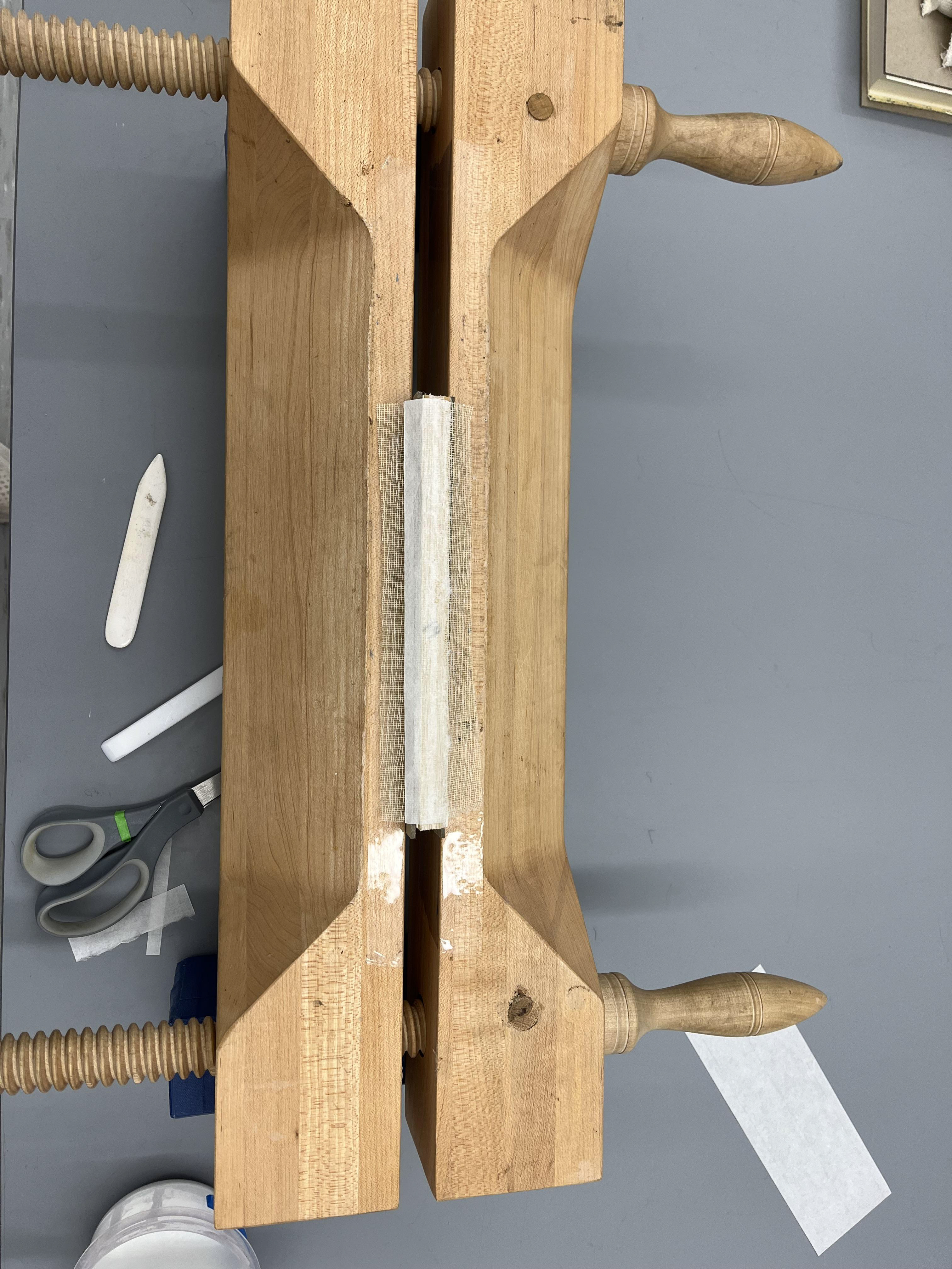
Text block in press to reinforce spine
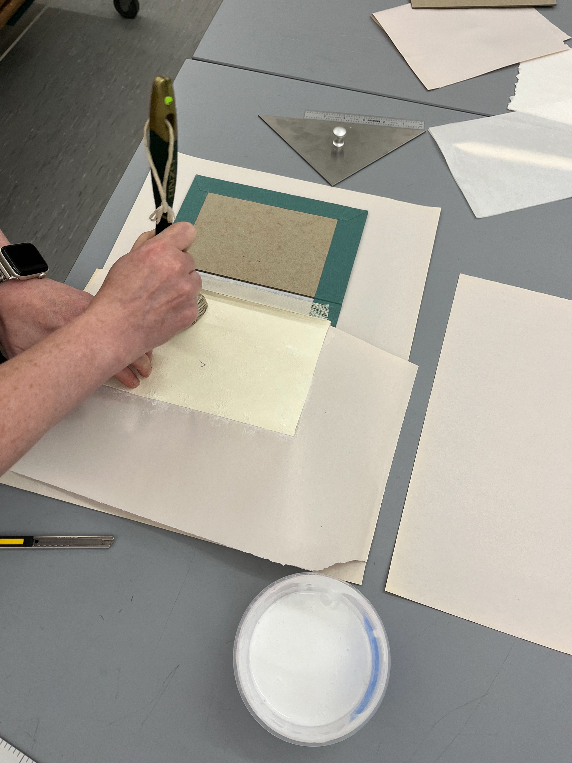
Gluing books together
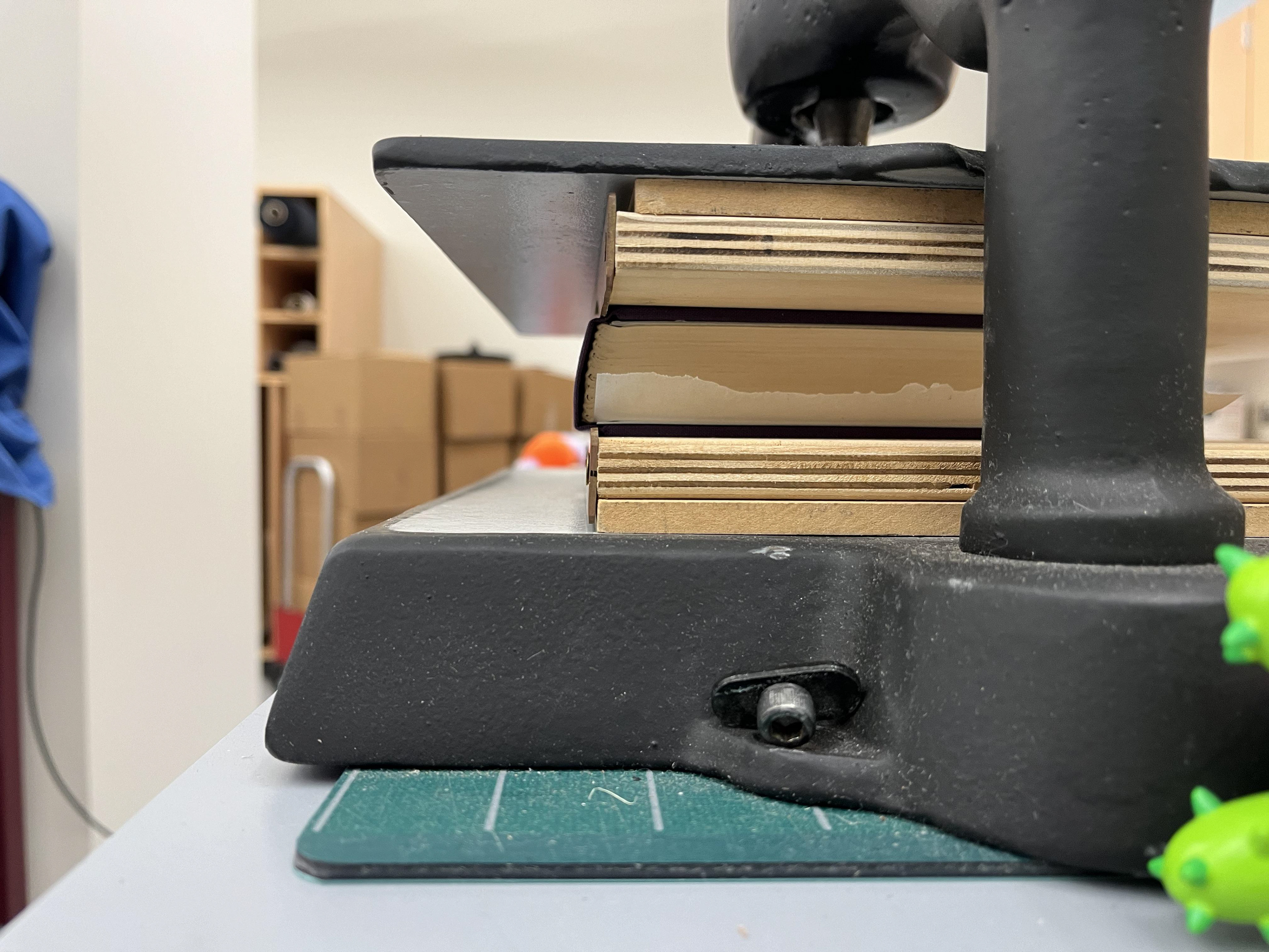
Book press
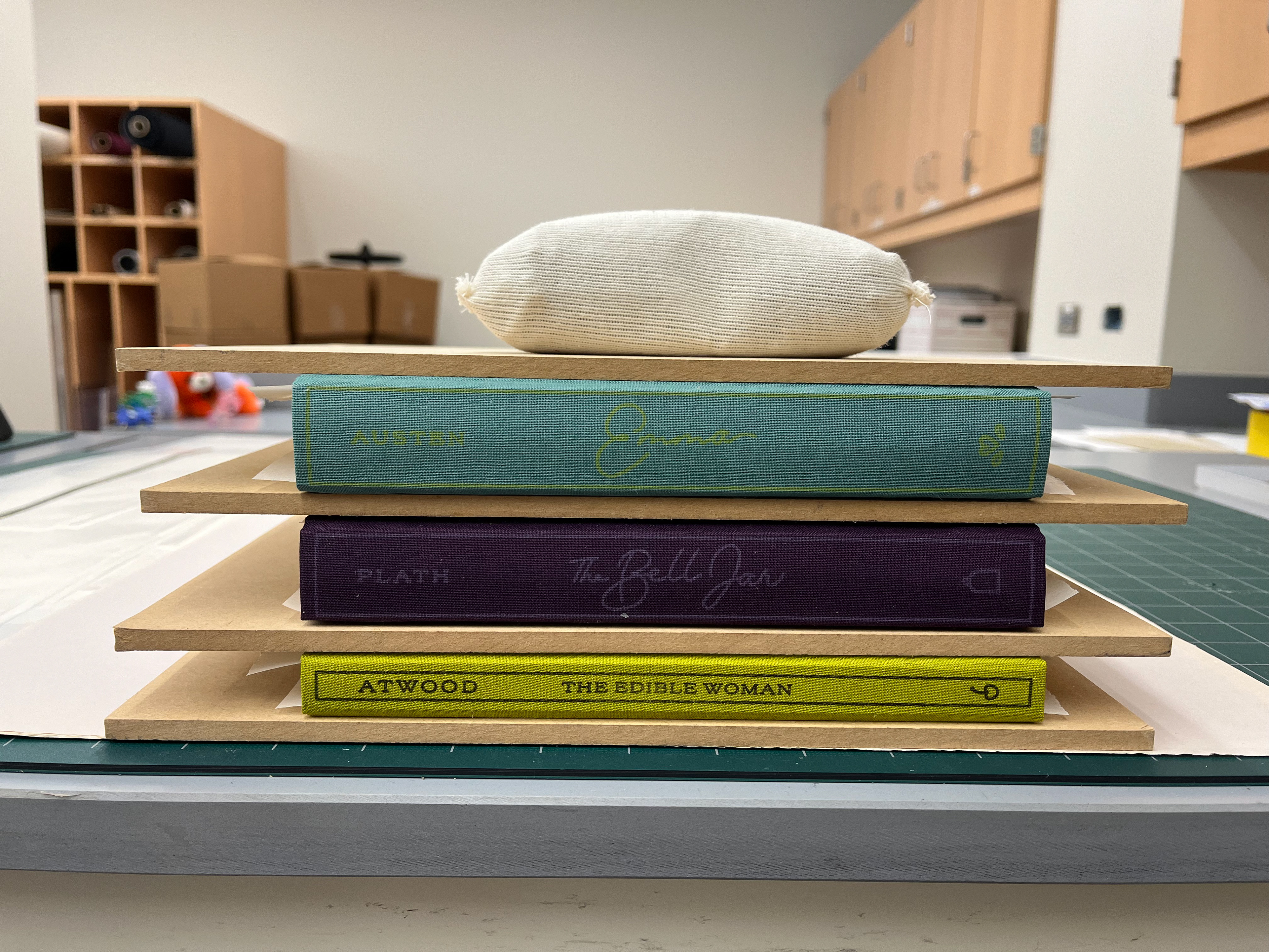
Final books drying with weights
Week 12
This week consisted of letterpress printing final covers and printing patterned end sheets. My mentor, Jeanne Goodman, and I went to BlackHare Studio in Waco to do a letterpress workshop with Virginia Green. A lot happened that day since we cut the book cloth, mixed ink colors using Pantone swatches, set up the letterpress, created test prints, and printed the final covers.
Last week, it was important that I chose what ink colors I wanted for each cover because once we got to the studio, we started mixing and testing the colors. Using the Pantone codes I had selected, we used the ink formulas to hand-mix colors. The yellow for Emma was the most challenging to get right since it was such a light color mixing with the blue cloth underneath. We went through five iterations of this color before landing on the final light yellow. To save time, I chose a true blue ink for The Edible Woman. It saved time since we did not have to mix any other inks with it. We also got the right shade of light purple for The Bell Jar on the first try. After each test print, I wrote notes on the back of the test sheet to keep track of our changes and progress.
These inks are oil-based so we had to cover them when not using them. We also hand-rolled the ink onto the plate on the letterpress using a brayer. This saved time since we did not have to clean the letterpress rollers after each print.
We used a Vandercook press for this process. Setting up the press can take longer than the actual printing process. This is because you have to align everything correctly to make sure your paper is hitting the plate at the correct spot. The first part of this process is making sure the bed is set up correctly. We used a boxcar base with the photopolymer plates adhered to it. We then had to use furniture (wood and metal pieces that fill in space on the bed, and then lock up the form using a quoin (small mechanical devices that use a key to expand). This whole process ensures the plate will not shift as the letterpress moves across it.
The next step was making sure the feedboard was set. We had to use the side guide (aids in laterally positioning a sheet of paper before transfer into the printing unit) and grippers (hold the paper in place) were in the correct spots according to the size of the book cloth sheets. We also could adjust the pressure used by adding tympan paper (the outer layer of paper that covers the cylinder). Once this whole process is complete, we are ready to print! We did eight prints for The Edible Woman and The Bell Jar, and 7 prints of Emma since we needed more book cloth for test printing. We did all the prints for one book at a time and then laid them out to dry.
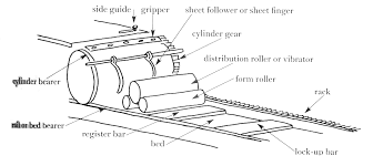
Parts of a Vandercook press
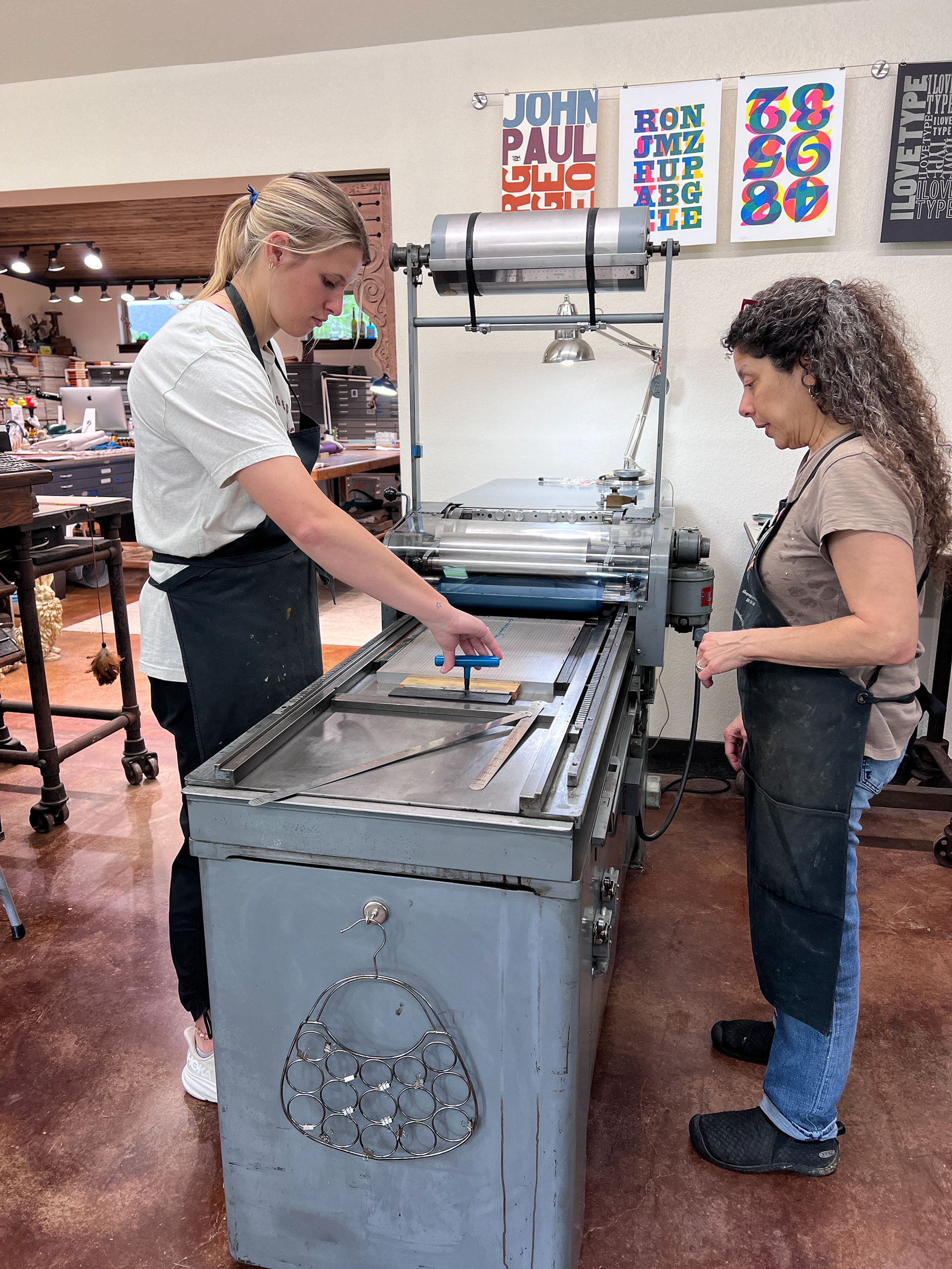
Locking up the bed using a key
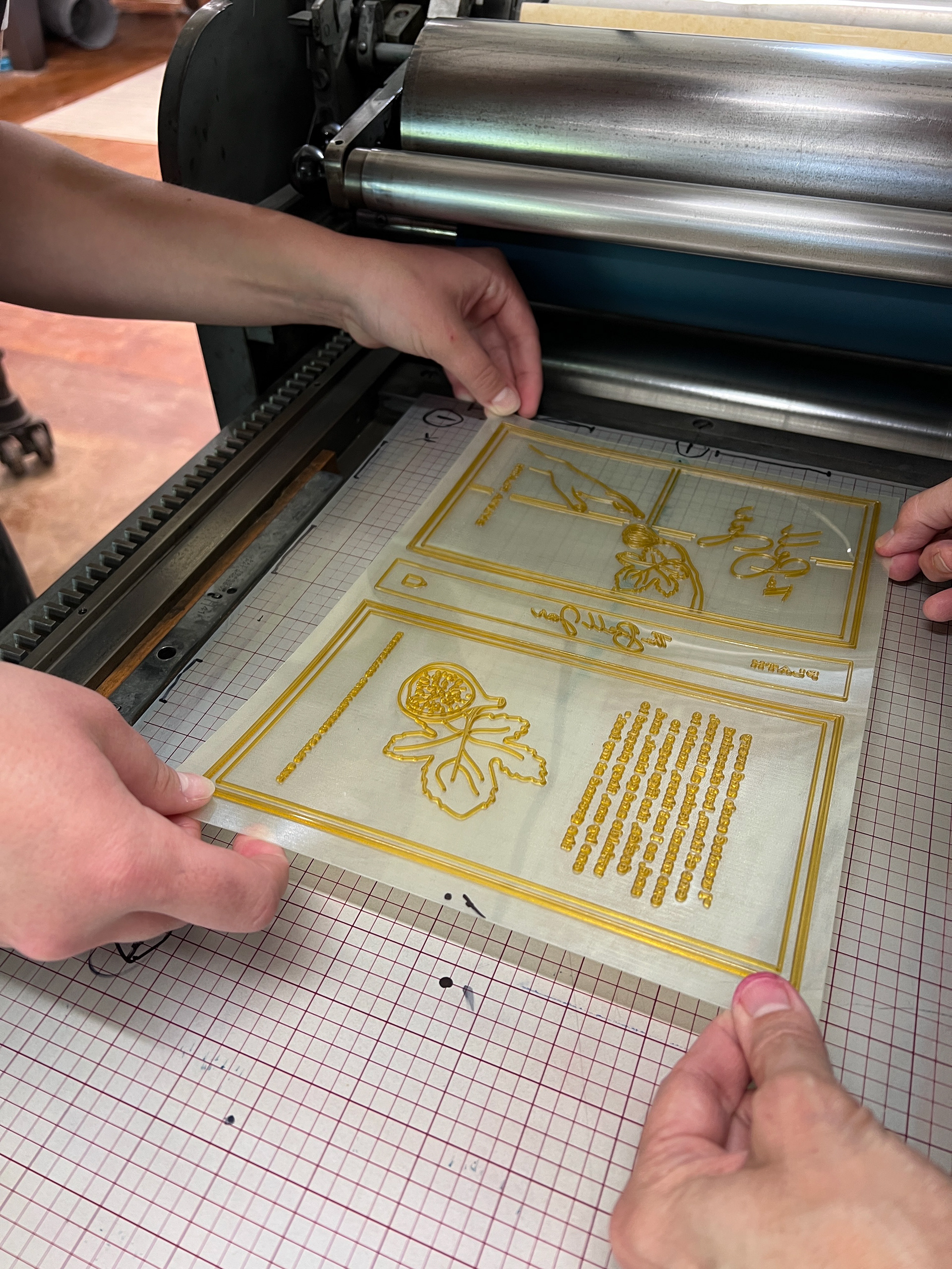
Lining up the photopolymer plate to the boxcar
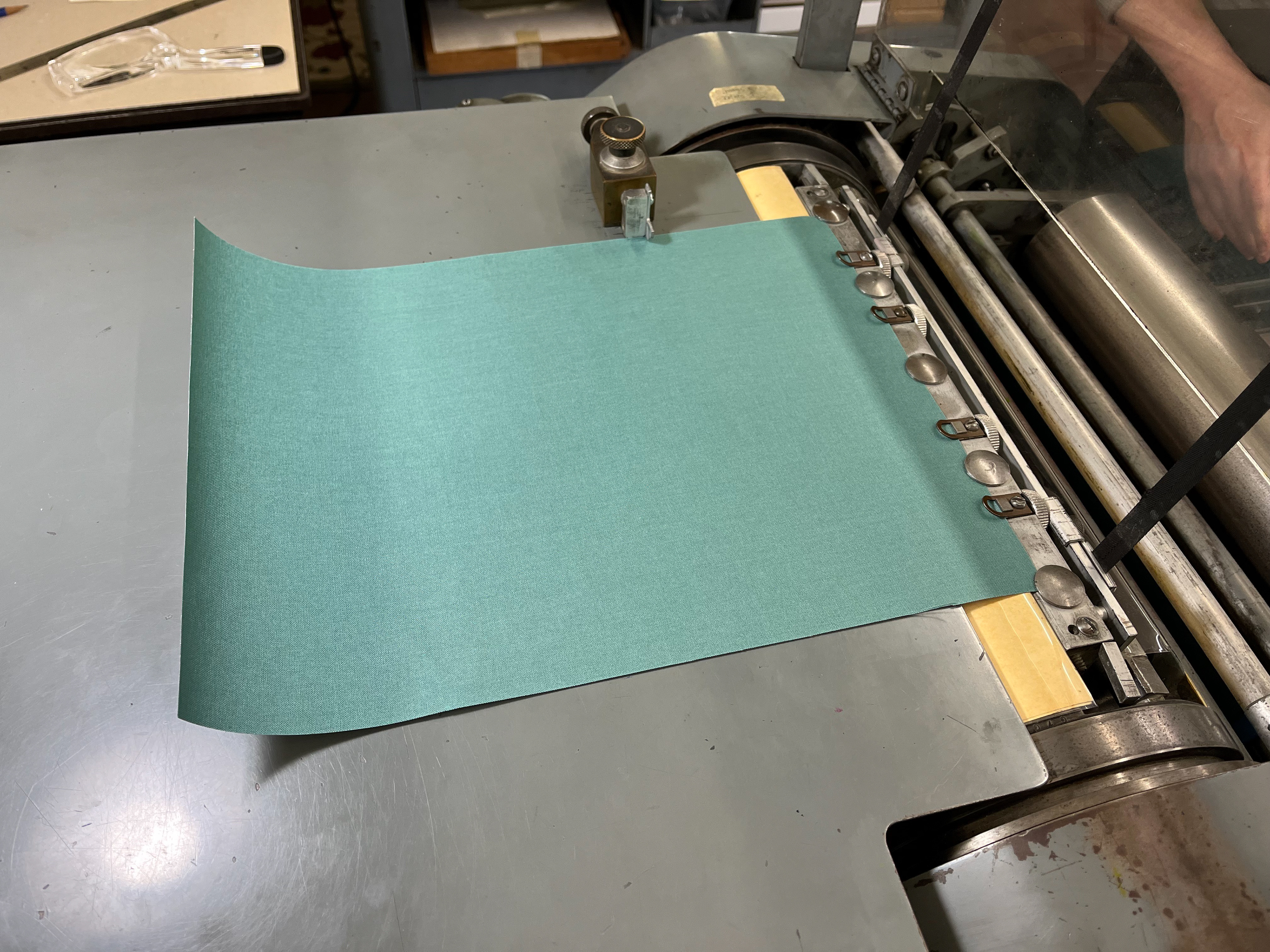
feed board, side guide, and grippers
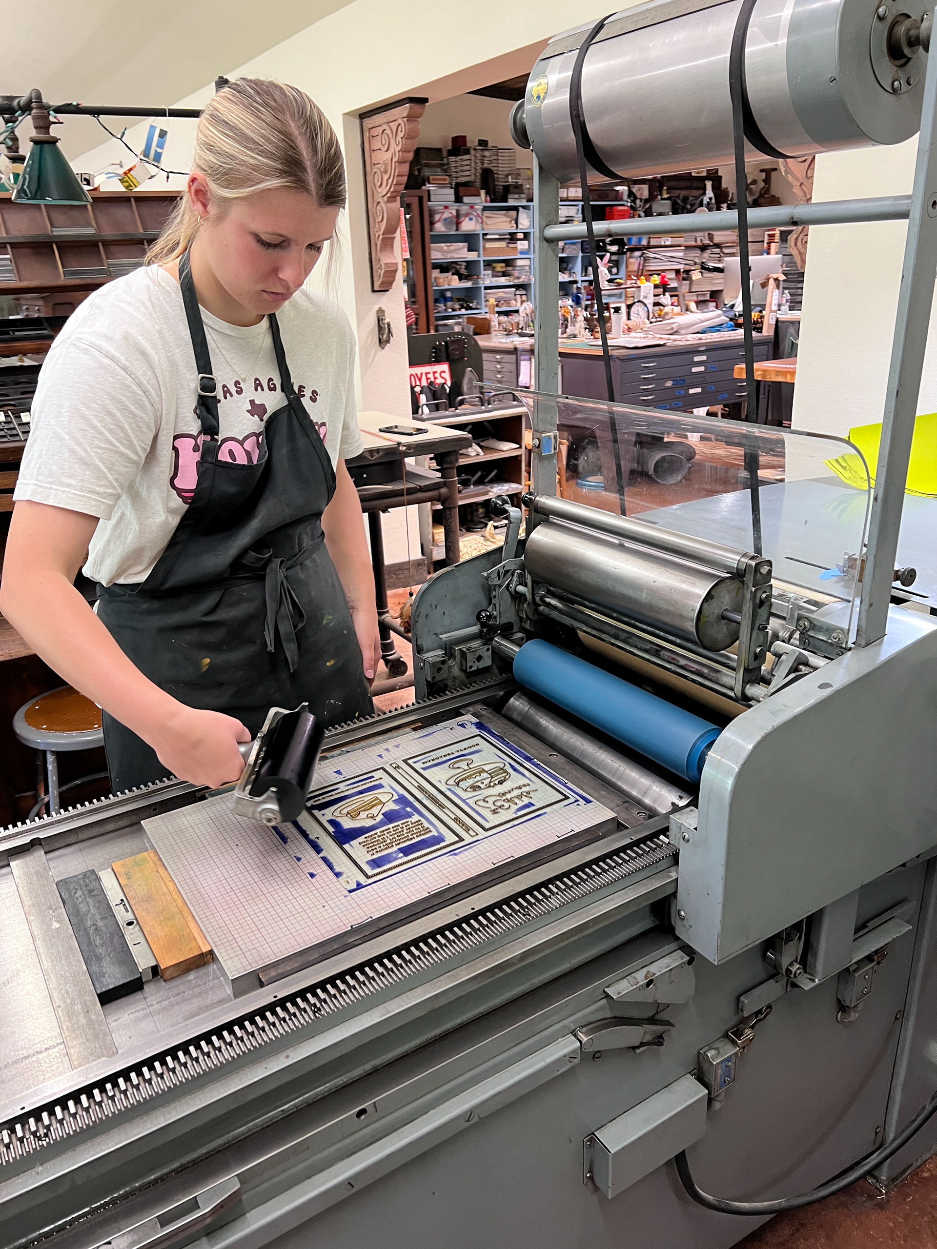
Inking the plate

Inked plate
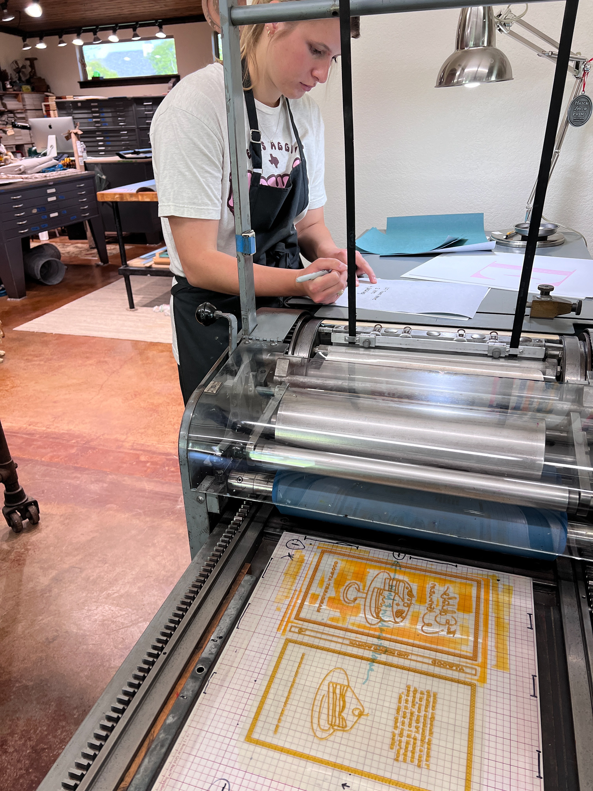
Notes between test prints
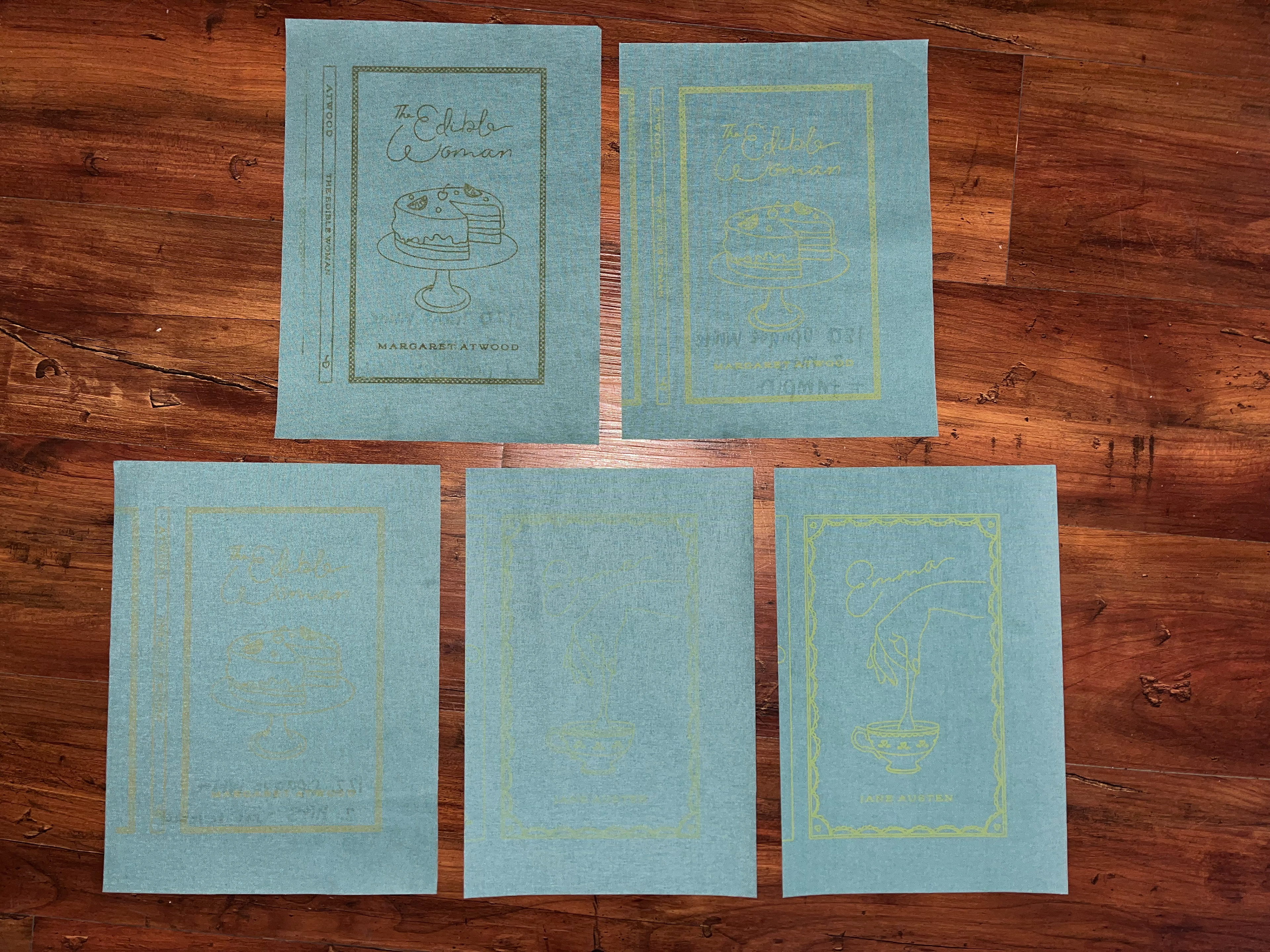
Emma test prints
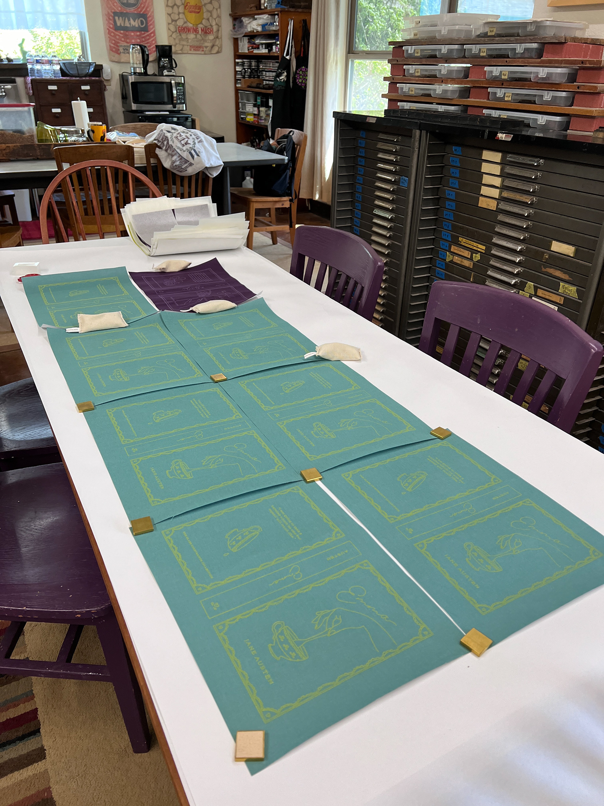
Final prints drying
Below are the final prints for each cover. I think they turned out great and I learned so much during the letterpress workshop. I will use a few prints to frame them to show the process while one will be used for the final cover. The next step for the books will be binding them. To complete that process, we will need end sheets which I designed and printed this week.
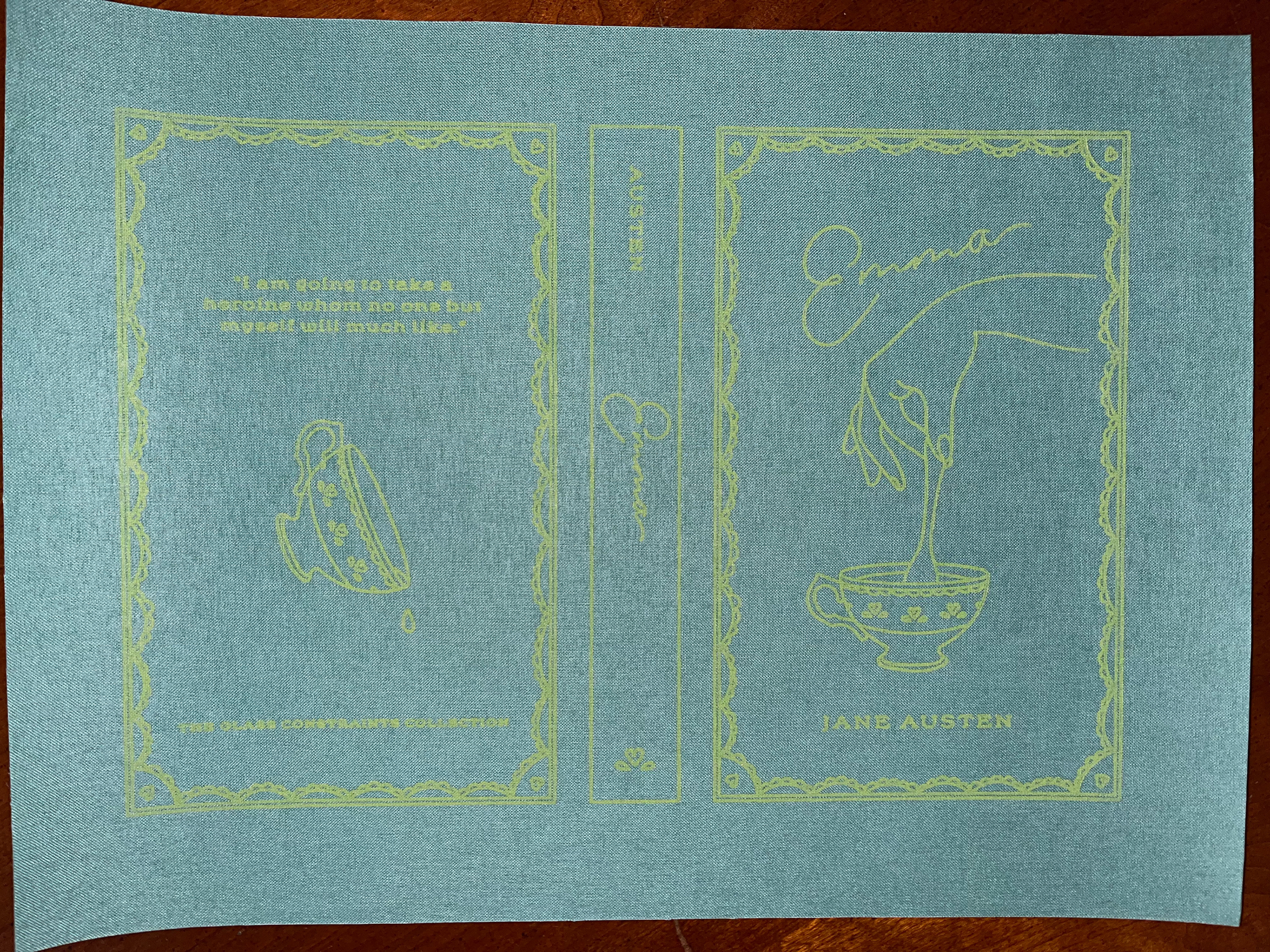
Emma Final Cover Print
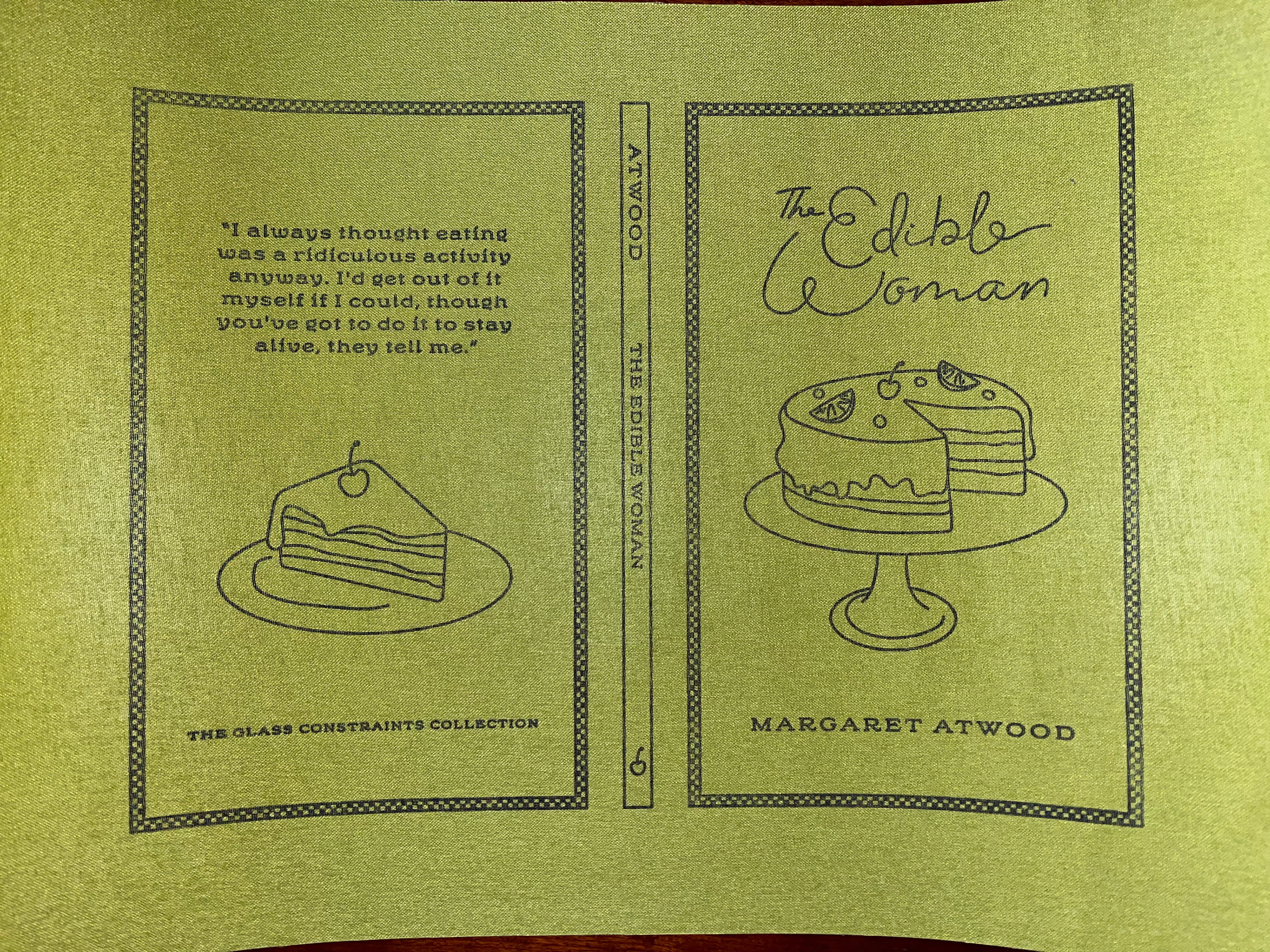
The Edible Woman Final Cover Print
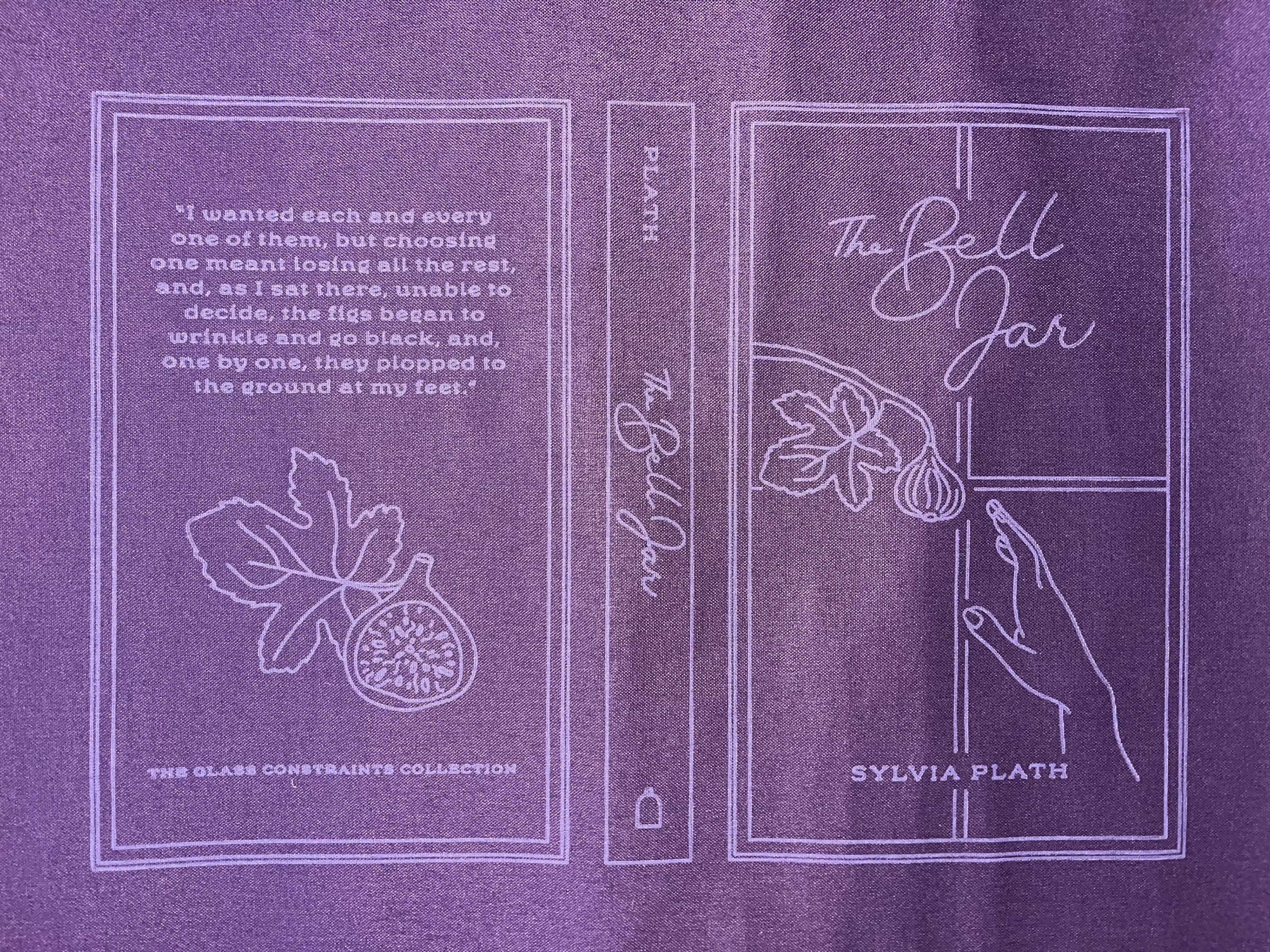
The Bell Jar Final Cover Print
For the end sheets, I started by finding inspiration and creating mood boards. All of the colors reflect the colors of the covers and the inks used. I knew I wanted The Edible Woman design to call back to the checkered pattern on the front and include food motifs. I ended up with a fun, blue and green checkered pattern that reminds me of a picnic blanket. For Emma, I used the hearts from the front and leaf shapes to create a 19th-century-inspired pattern. Lastly, I wanted to create a city pattern to give more context to the window for The Bell Jar. It's almost like when you open the cover you are looking through her window and out into the city. Once I had designed these, I got feedback from my small group and mentors and had them printed on Mohawk paper at Copy Corner.
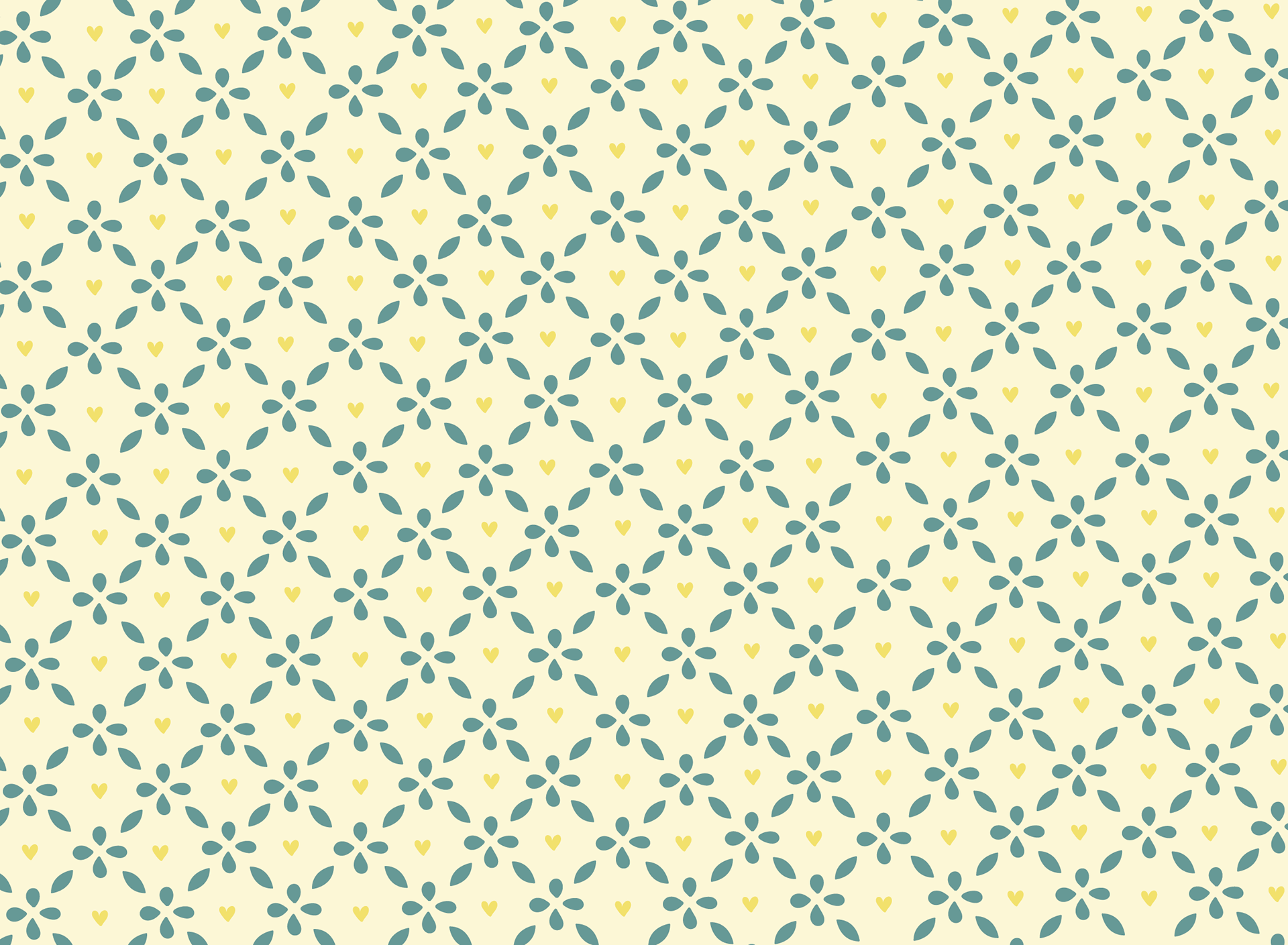
Emma Pattern
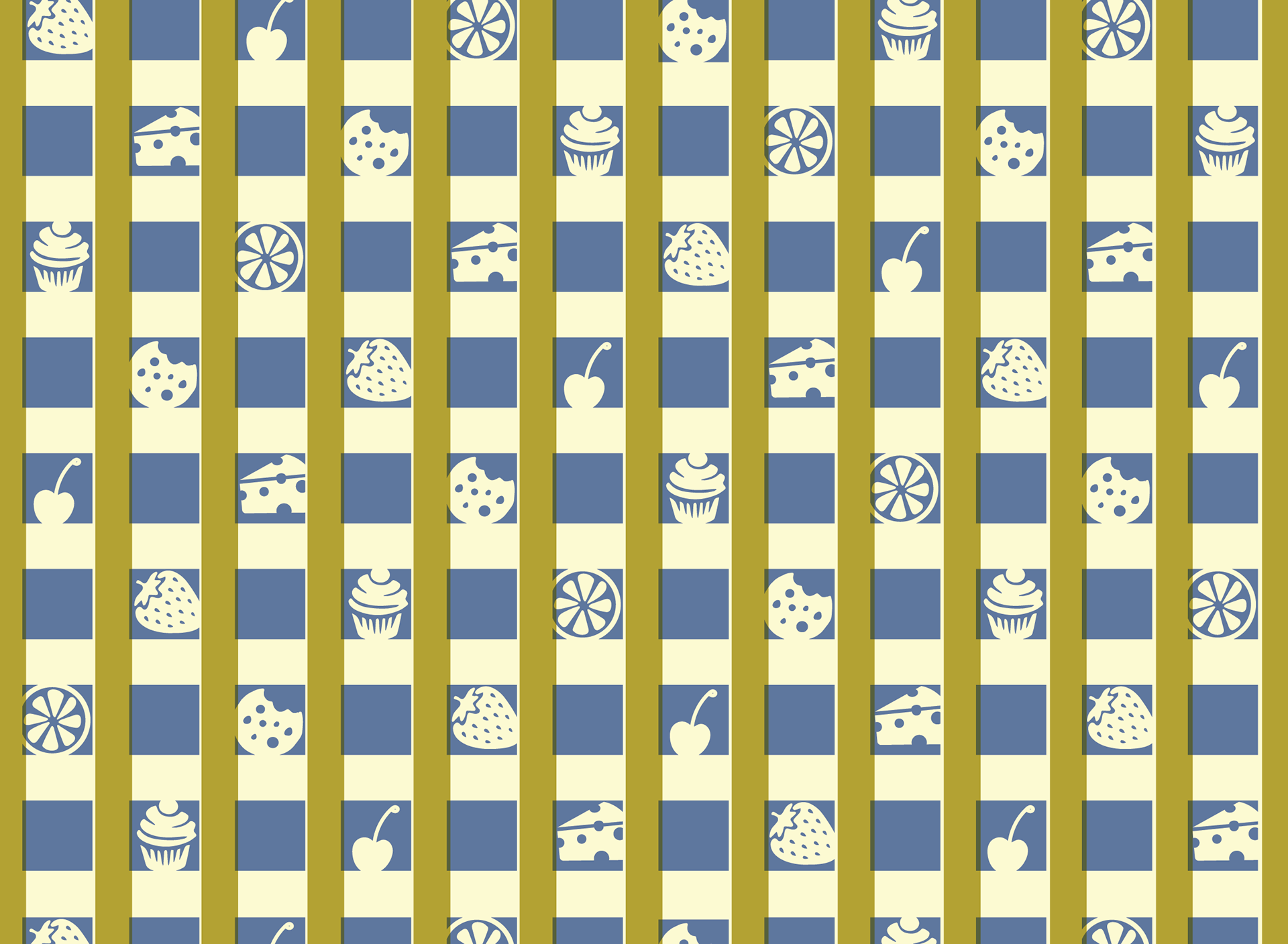
The Edible Woman Pattern

The Bell Jar Pattern
Week 11
This week I worked on color tests for the ink colors that will be used for the final covers. We are mixing the ink by hand using Pantone colors so I checked out a Pantone swatch book from the library and did some research online to choose potential colors for each book.
These are my color choices for Emma. With the dusty blue fabric, I think a lighter blue, darker teal, or yellow will complement the fabric well. The blue alludes to the tranquil bubble that Emma's wealth provides while the yellow could represent how Emma is the sun her entire world revolves around.
Emma Color Tests w Pantone Swatches
For The Edible Woman, I researched popular colors in the 1960s since that's the period the story is set in. Bright, psychedelic colors were popular so I think the bright blues or yellows work well. They also compliment the olive green nicely. I picked the green cloth because it reminds me of the sick feeling the character gets when she thinks of eating.
The Edible Woman Color Tests w Pantone Swatches
I also researched popular colors during the 1950s for The Bell Jar. Pastel colors were popular during this time so I experimented with pastel greens, pinks, purples, and blues. I also tried warm shades of pink, coral, and orange to see how they looked with the dark purple of the fabric. It is a difficult choice because so many colors look good on the purple. I think the decision for this book will happen when we are testing colors in person.
The Bell Jar Color Tests w Pantone Swatches
Week 10
My plates came in from Boxcar Press this week. It is so cool to see my designs professionally printed onto plates and I cannot wait to see the completed covers. These plates will be used on a letterpress machine to print the covers.
The plates are made from photopolymer which is photosensitive material in sheet form that is exposed to UV lights through a negative film. The light shines through the clear sections of the film and hardens the polymer. Then, the plate is washed out with water and the exposed areas are left to form the relief while the unexposed is washed away. The plate is dried and exposed to UV once more to complete the process. The plate image and text will be in reverse so when mounted onto the base system in the press, it will be inked and print right-reading onto the paper. The polymer of a plate is connected to double-stick adhesive which then connects to a non-magnetic letterpress base.
Polymer Plates
Week 9
This week I officially finalized and ordered plates from Boxcar Press. With the dimensions changing slightly, I did have to make a few minor adjustments to my designs. On Zoom, I met with my mentor, Jeanne, and her colleague, Virginia Green. Virginia is a professor at Baylor University and works at BlackHare Studio, a letterpress studio in Waco, where we will print the final covers. In this meeting, we discussed the final designs and the specifications for printing. We also made sure we would have everything ready to go for our letterpress day on March 29th.
Additionally, I ordered my bookcloth from Book Craft Supply Co. in Long Beach, and it should be here by the beginning of next week. Once it comes in, Jeanne and I will cut pieces and make the casings for the covers so everything is ready to be printed.
My next step is deciding what color ink I want the designs to be printed in. I will do color tests in Photoshop to narrow down the options. Virginia suggested having three colors in mind for each book since they could change or look different depending on what is available in the studio. I will also need to find the Pantone equivalent to each color so we can mix them in the studio the day we print.

Final Bell Jar Design (sent to print)

Final Emma Design (sent to print)
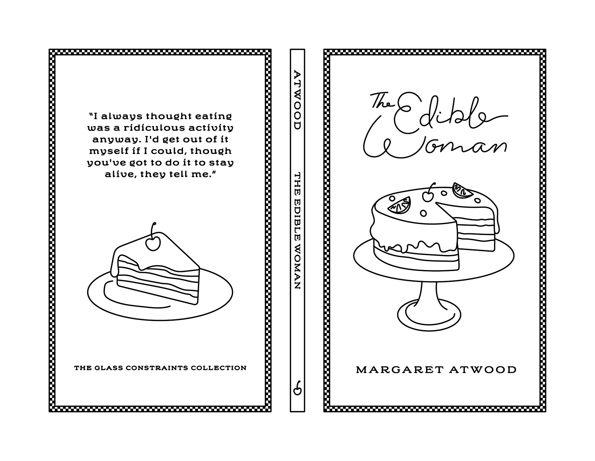
Final Edible Woman Design (sent to print)
Week 8
This week I am working on finalizing and packaging my final designs to send them to print. It is taking longer than expected since I am waiting to hear from mentors and printers to make sure everything is perfect. I needed to adjust the sizes of my artboards since I now have the final measurements of the covers. I created a template for the final designs and am working on adjusting the designs to fit the dimensions of the final boards. When I started designing the covers, I guessed the size since I didn't have the physical books until later. The only thing that needs to be changed is the borders of the designs. The spines are all different widths since the books are different thicknesses so I will need to adjust those as well. My goal was to send these to print by the end of this week, but it will be later by the time I hear back from mentors and printers. Luckily, the turnaround time for these plates is about a week.
Templates with Final Measurements
I have decided on my colors for the book cloth. I want to use Dusty Blue for Emma, Olive for The Edible Woman, and Grape for The Bell Jar. I will need to order these from Book Craft Supply Co.
Week 7
This week I had test plates made to create practice prints of two of my designs. I originally was going to transfer the designs to linoleum blocks by carving them, but the process proved to be tedious and the designs were not accurate. I sent my files to the woodshop on campus, and they laser-cut the designs onto 1/8" MDF boards. In Illustrator, I had to ensure all my designs were outlined and expanded to be converted to AutoCAD files. The designs also had to be mirrored to print correctly when I transferred them to the book cloth. The designs looked great, the only issue with the plates was that the cuts were not deep enough so it made printing difficult. The ridges were not high enough so they did not ink as clearly as I wanted.
Overall, I got a good idea of how the designs will look, have a better idea of how the printing process will work, and know how to prepare my files for printing. When we do the actual prints for the covers, the ridges will be deeper and the material will be more durable. We also will use a press that will emboss the designs into the book cloth, making them stand out even more.
Laser-cut MDF Plates
Below are the two designs printed using Speedball ink. I used white ink on a darker book cloth and black on a lighter color. If the ridges were higher, there would not have been ink on the negative space of the design. I think the test prints help me better understand the process and what will need to happen for the final prints.
Test Print for Emma
Test Print for The Edible Woman
Week 6
This week was the 50% mark for capstone, meaning I am now shifting my focus from primarily cover design to bookbinding. The last phase of cover design is final edits to the designs, cleaning up the files, and adjusting them to the size of the books. To get the correct measurements, Jeanne and I started deconstructing the books. This included removing the old covers and end sheets to get the text block by itself so we could cut them down and measure.
Cutting Books in the Lab
Deconstructed Books and Their Old Covers
Since I want to create a box for this set, I need all the books to be the same size. Once all the covers were removed, we were able to cut the text blocks. Jeanne showed me how books were cut historically using a plough, but for consistency and efficiency, we used an electric guillotine.
The Bell Jar was the smallest book so it essentially became the template for the other two books. We still needed to trim the pages of it to remove the worn sprayed edge and deckle edge. (Historically, deckled edges were from handmade paper where the mold cover resulted in a rough, feathery texture.) We also cut The Edible Woman to the exact size of The Bell Jar but were not able to cut Emma due to the spine currently being rounded. We will cut Emma later on, but it will be the same size as the other two books.
Unbound Book Spines
We were able to use the old cover from The Bell Jar as a template. In millimeters, we measured the cover boards, spine, and groove (the small seam that runs vertically down the book itself between the book boards and the spine). Using the measurements from this, we were able to determine how big my artboards/designs need to be before I send them to print. This means I will need to adjust my designs slightly before they are completely done, and I want my design mentors to have one last critique.
Old Bell Jar Cover as Template
Week 5
I made more progress on the cover designs this week. Since I had decided on a style direction with Emma last week, the process for my next cover designs went quicker. Having a style and an idea of the illustration content was helpful. I also picked a typeface for the author names and more content on the back covers. For the book titles, I decided to handwrite the words so I could customize the letters and have them match the illustration styling. I think this helped the type and illustrations feel cohesive.
Progress on Emma Cover Design
This is my progress on The Edible Woman cover. I wanted to go with the cake imagery and add fruit to it to allude to more of the foods she couldn't eat. I liked the checkered border for this book. It feels retro which plays into the fact the book is set in the 1960's. It also reminds me of a diner or kitchen that goes with the food concept.
I am happy with how this cover turned out. The designs feel different and reminiscent of their stories and themes, but still feel very similar and cohesive. Having a similar placement of type and illustrations, a consistent style, and a border element helps bring them all together.
Progress on The Edible Woman Design
This is my progress on The Bell Jar. I liked my concept of the window, but also had the idea to combine it with the figs. I wanted the window frame to serve as the border element for this cover. I am still fine-tuning this one with my mentors, especially the placement and spacing of the fig and hand.
Progress on The Bell Jar Design
I also started to work on the spine and back covers of the books. I wanted to continue the border and illustrated elements to keep the design cohesive. The illustrations pair with the ones on the front and almost tell a narrative about the stories. I included the authors' last names on the spine as well as an illustrated element from the cover design. It was nice to be able to customize the type since I had to adjust it for the longer titles to fit.
I included the set name on the back. I am exploring making a monogram logo to go with the set that I could include on the spine and the box design later on. If I decide to go this route, I will replace the illustrations on the spine with the logo.
These designs are not finalized yet. I am going to take the weekend to sit with them, clean them up, and make final adjustments with my mentors' feedback. Once I have these completely done, I will take them into Photoshop to do color tests. I also plan to test my line weights by practicing printing using linoleum. This won't have the same effect as printing with the plates and foil but will give me a general idea of how they will look. I am currently on track with the project and am cleaning everything up for the 50% check-in this upcoming week.
Week 4
This week I started designing my covers in Illustrator. My initial progress was slow, and I was feeling very stuck. At first, it was hard to translate my sketched ideas into a digital design. There is a lot of thought and consideration that goes into book cover design such as typography and how they interact with the illustrations, what style of illustrations you use, and layout of the design. Trying to visualize and design all the covers at once was overwhelming, and wasn't allowing me to focus on the details of each cover. Towards the end of the week, I was able to meet with my mentors which helped me make some forward progress on Emma.
This was my initial progress on each of the covers. I was tandem designing Emma and The Edible Woman and it became very overwhelming. I was exploring the carriage and portrait ideas for Emma and the glass cake plate with a cake for The Edible Woman. The first designs were simple with small typography in the same place on the cover. From these designs, I decided I liked the line drawing style, but didn't like how geometric the cake plate looked. I wanted the illustrations to have more movement with a handmade feel. I also liked the border element but was considering adding more detail.
Meeting with my mentors helped me move forward in the design process. Coralie encouraged me to just keep trying things and pushing the designs further since you never know what you'll come up with when you keep experimenting and seeing what works. She had great advice that allowed me to loosen up and start to enjoy the design process more.
Initial Digital Progress
Since tackling all the covers simultaneously was overwhelming, I decided to fully explore one cover at a time, find a style that worked, and then continue that throughout the set. This is my current progress on Emma. I had the idea to illustrate Emma's hand using a spoon to stir her tea. This imagery alludes to how Emma meddles in the lives of the people around her. This design provided more interest and movement. I started exploring more patterns and borders as well as typefaces. I am leaning towards handwriting the covers. I enjoy the hand-drawn line art feel of these illustrations and want to continue that into the next covers.
I am feeling much better about my direction and will send these designs for feedback from my mentors while I start on the next book. From their feedback, I will continue to refine the designs. I am still aiming to have these designs done and cleaned up by February 20th.
Emma Cover Design Progress
This week, I also started thinking about the colors for the binding cloth for each book. I want them each to be bound in different colors. For Emma, I am leaning towards a teal or light blue. The bright greens and pinks remind me of food for The Edible Woman. A deep purple works well with the fig imagery of The Bell Jar.
Jeanne is helping me find a quality binding cloth to use in the colors I am looking for. With her help, and once the designs are finalized I will choose the final cloth colors. The next step after that will be exploring color combinations for the ink the design will be printed with. Coralie suggested exploring color combinations by creating mockups in Photoshop.
Binding Cloth Color Swatches
Week 3
This week I focused on concept development for each book. Researching the storylines, themes, and imagery helped me gain a better understanding of each book and what it is trying to communicate. My next step was to form mood boards to help guide my visuals for each design. From these mood boards, I created thumbnail sketches that I discussed with one of my mentors, Jill Honeycutt. Jill helped me narrow down to a few directions for each book. She also suggested that I sketch the cover designs together to help visualize them as a set. This was beneficial and helped me determine that I wanted the elements of the designs to be in the same place on each cover.
Emma is a rich young lady who lives with her father in Hartfield, their English countryside home. She has no plans to marry since she has all she needs at Hartfield and would never leave her nervous father. Emma is convinced she is a good matchmaker since she basically introduced her old governess, Miss Taylor, to the town widower, Mr. Weston. With this misplaced confidence, Emma befriends a local schoolgirl, Harriet, and plans to set her up with someone above her station. This meddling causes many embarrassing moments, confusion, and a fumbled engagement for Harriet with a farmer. In the end, Harriet marries the farmer she loves and Emma finds love with her friend, Mr. Knightley. The book is hilarious and light-hearted yet contains critiques of society's expectations of women and how they can be stuck in their own social classes.
I liked the portrait imagery for the cover design because at one point in the book, Emma paints a picture of Harriet for the man she is trying to set her up with, and the man ends up confessing his love for Emma instead. As a painter, Emma changes her subjects to make them look more desirable. The portrait represents her skewed view of the world and how she meddles hoping to control the people around her. The carriage has a similar theme. It represents how Emma is in her sheltered world and her lack of understanding of how her actions affect others.
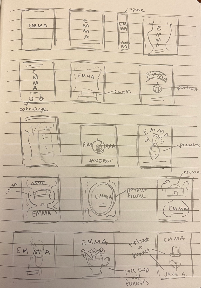
Thumbnail Sketches for Emma
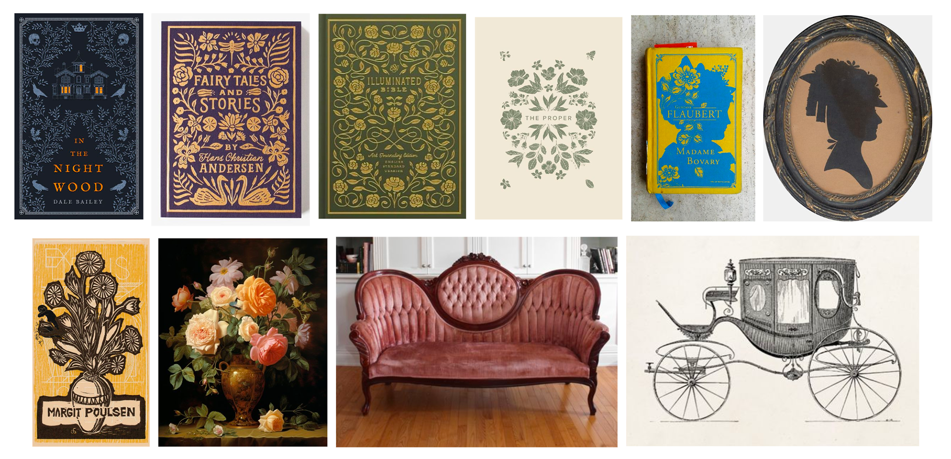
Emma Mood Board
The Edible Woman follows Marian, a young woman who gets engaged to Peter. During their engagement, she starts to feel consumed and loses her ability to eat. It starts with meat and slowly becomes eggs and fruit until she can't eat anything by the end of the book. At the end, she offers Peter a cake shaped like a woman. When he refuses to eat it and they break up, she feels free again.
I wanted to include the food or plate imagery in my design. I came up with the concept of a grocery cart or bag that has food in it to represent how Marian feels trapped. I also like the concept of a cake plate with a glass top or a woman in a teacup.
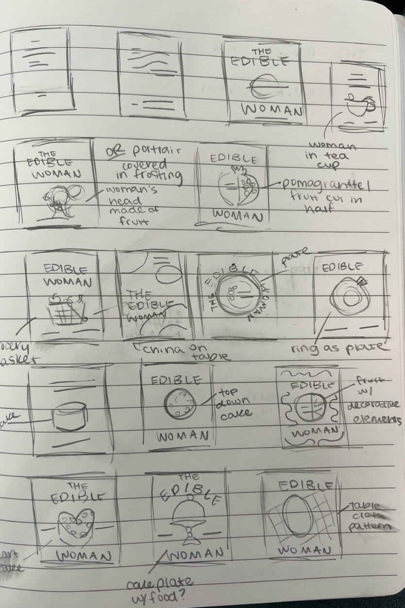
Thumbnail Sketches for The Edible Woman
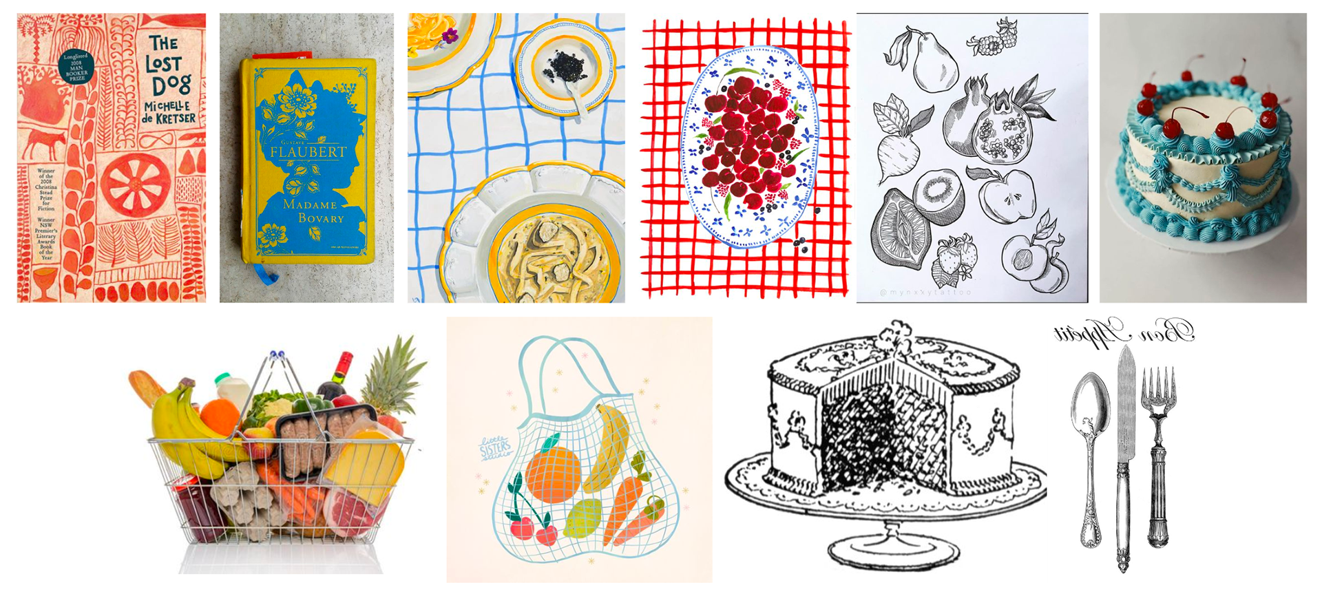
The Edible Woman Mood Board
The Bell Jar is Esther's dark coming-of-age story. Esther is a college student who has things happen to her that would typically benefit a young person's life, but they overwhelm her and she slowly loses her grip on reality. She gets an internship in New York City and gets engaged, but they both terrify her and she is paralyzed by the thought of choosing what she wants to do with her life.
In one excerpt from the book, Esther is sitting in her New York apartment looking at the window as if it were a poster. She feels as if her life is happening to her, not that she is living it. In another chapter, Esther gives an example of a fig tree full of fruit ready to be picked. Each fig represents different paths or directions she can take in life. Instead of choosing one, she is sitting under the tree starving because she can't make up her mind. I want to incorporate one of these elements since they represent Esther's perspective so well.
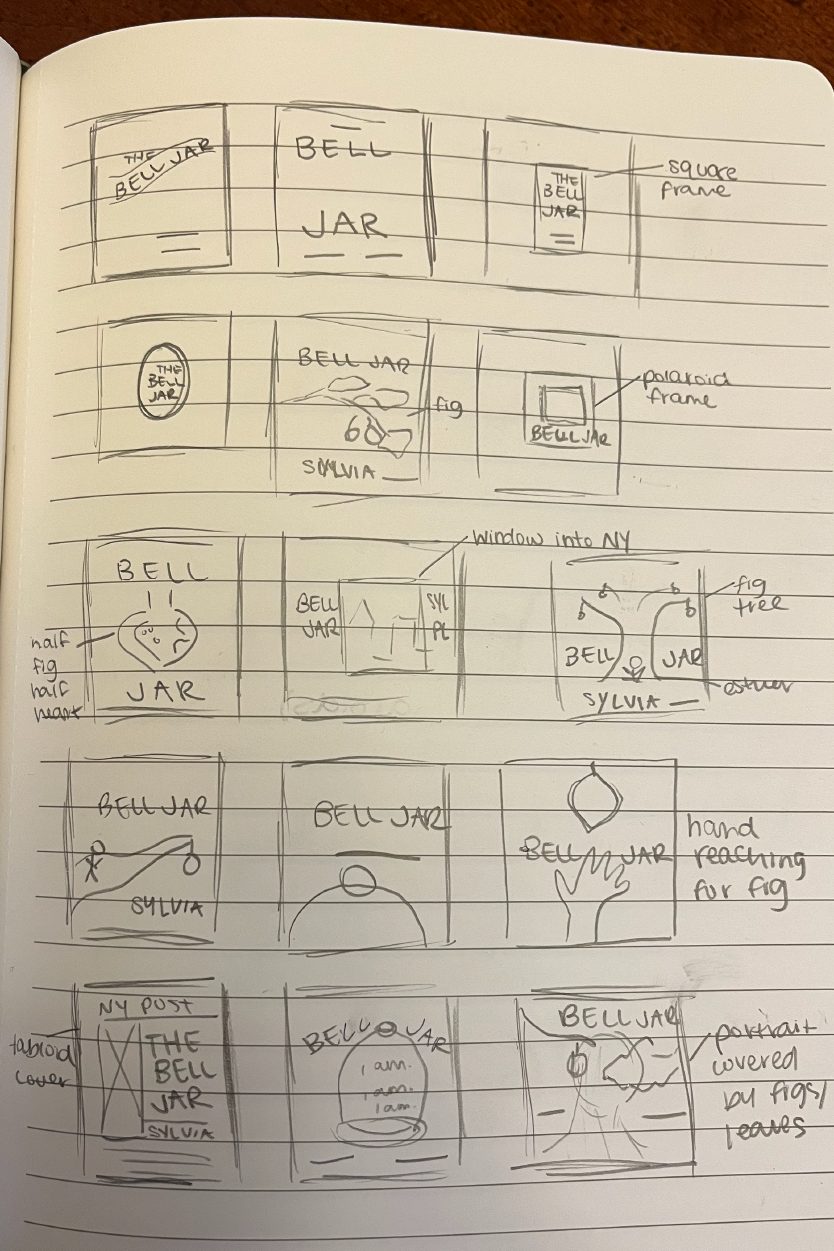
Thumbnail Sketches for The Bell Jar
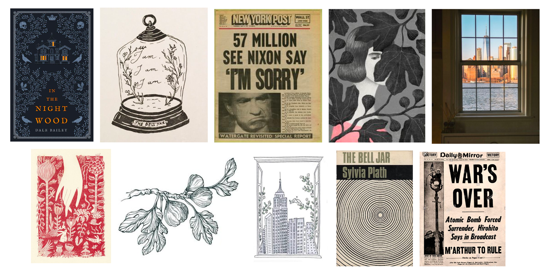
The Bell Jar Mood board
I am approaching these redesigns as if they were being sold as a boxed set. The designs will need to have a unified type and illustration style. Even though each book takes place in a different period and has a different approach, they all explore the female identity and societal expectations of them. After a discussion with my small group, I decided to name the set "Glass Constraints" since each main character has an unseen thing that is trapping them or holding them back but is hard to recognize or see until you analyze their story. I am hoping to make a designed box with this theme on it to put the hardcover books in.
I had another meeting with Jeanne to discuss the materials I need to start ordering. The second-hand books have all been shipped and are on their way, but I need to start finding binding cloth in the colors I want. Jeanne encouraged me to make a budget after I researched all the materials I would need. She and I also made a plan to test different printing methods and materials so I could get experience with a variety of them.
Lastly, I found my last mentor who is working in the industry. I reached out to a London-based cover designer that I admire, Coralie Bickford-Smith, who designed and illustrated the Penguin Random House Clothbound Classics series. She agreed to be one of my mentors so we will meet when I have more digital progress to show her.
My next step is to continue designing my covers and take them into Illustrator to have digital copies. The goal is to have these designs finalized by the end of February.
Weeks 1 & 2
The first two weeks consisted of planning details of my project as well as finding and meeting with mentors. Two professors at Texas A&M agreed to mentor me. Jill Honeycutt will give design and layout feedback, and Jeanne Goodman will teach me all I need to know about bookbinding and the cover printing process. I am also reaching out to industry mentors.
In my meeting with Jeanne, we discussed bookbinding, what a realistic timeline could be, and how we could print my cover designs onto rebound hardcover books. She also showed me how to look for used books for rebinding purposes and what criteria they should meet. I have begun ordering these books so I will have them on hand.
The three books I will be redesigning and rebinding are The Edible Woman by Margaret Atwood, Emma by Jane Austen, and The Bell Jar by Sylvia Plath. I selected these classics since they are all written by women and contain female narratives from different perspectives. The stories are set in different periods and have different approaches, yet each novel examines the female identity as well as societal expectations of women. I am approaching these redesigns as if they were going to be sold as a set.
I also have started the design process for my three book covers. My process started with researching the books, their storylines, and themes. After research, I began making mood boards and sketching. In the upcoming weeks, I will meet with Jill to discuss and adjust these designs. My goal is to have all cover designs finalized and digitized by 50% check-in so the rest of the project can be focused on printing and binding.
